An Interview with Illustrator and Graphic Designer Vince Chui
Part 2 of 2 (link to Part 1)
Click any image to biggenize
 Vince, I’m curious: when you get an assignment then for a movie or let’s say even a video game for example with SEGA, how is the process set up? Do you continue to work from home in a ‘freelance’ mode or do you move to a different city and set up with the local ‘think tank’?
It’s sort of a mixed bag. With the project you mention, I was working full-time with Pseudo Interactive and Sega was the publisher on one of the projects. So I worked in a office with my other PI co-workers on this project. Sometimes I participated in meetings directly with the Sega people, but this was rare. Most of the information I got to work with came through my art lead and friend Ted Kim.
Like I said though, that gig came to an end. Since then, I’ve done mostly freelance assignments where I’ve been able to work mainly from home. Sure, it’s nice to get out now and then in order to interact with other creative people, you know, work as part of a team with your peers. There’s a certain vibe I find in that kind of environment that can just energize the whole atmosphere. But it’s also nice to be in a familiar environment and get settled down to work, especially those long projects.
Sometimes it really is a marathon – where even working from home you almost need to know how to pace yourself with the heavy workload.
 How does an illustrator wide up getting a ‘gig’ with a movie or video game production? Are you out there really pushing your work to Hollywood or is there some kind of local representative you have or how does it happen exactly?
I can’t say I’ve been all that active in terms of really pushing my stuff out there. I’m just very lucky that I have talented friends who have given recommendations that bring me into projects and introduce me to the right people.
I also think being able to be flexible helps as well. I’ve come full circle in terms of doing things to get this point, that is, trying out and dabbling in all kinds of different stuff in the big world of Illustration. But I do believe equal parts networking and hard work go hand-in-hand ... and if you have that, then opportunities will eventually come your way.
 As I mentioned earlier, you’re a member of one of my own favorite illustrator collectives, namely ‘Sketch Motel Illustrators’. How important is being hooked up with a group like this to you and how close are you to your fellow compatriots that use this site? Do you ever find yourself, for example, ‘stuck’ in terms of a piece or some kind of detail and call up one of these other talented artists for suggestions or even direct help?
Yeah, I’m actually one of the newer members on Sketch Motel. But it’s definitely great exposure and also an honor to be included with talented peers. Also there’s a great pool of knowledge in that group. You mentioned Charlene Chui, who I know pretty well. I met her through the Street Fighter tribute book. I saw her Chunli entry and we started talking and we’ve been friends ever since.
On the other hand, I met Huan Tran through Ultimate Frisbee (he throws a mean Frisbee, and his team had just beaten our team!!). In fact, I had no idea Huan was an illustrator at the time, but I got to know him better through Charlene.
And oh yes, being ‘stuck’ on a piece is one of the most frustrating things you can have. So having a small army of extremely talented friends who can help get you out of that ditch is awesome. They help in so many ways, be it with fresh ideas, or recommendations on composition, you name it. You need that outside opinion at times, especially if you’ve been staring at something too long.
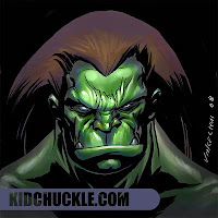
I also enjoy that you include videos of some of your sketching and production of different pieces. Why have you decided to share what I consider to be an almost ‘intimate’ side of your work and show people so much of your creative process in terms of tutorials and detailed sketch work? (ZN: click here to access Vince’s step-by-step creation of the brutish looking fellow shown below)
Hmm... well, I’ve never considered my process as all that intimate or even very secretive. At first, when I started making the videos, I was doing it more for my own personal growth, like an exercise. I figure if I recorded myself drawing, I could streamline my process and be more comfortable under time constraints.
 Over time, I had some people ask me for more details, so I tried to set up some more in-depth tutorials. But I’ve only recorded one with a voice-over, mostly because I’m not an audio engineer and thought it was kind of frustrating. I would like to do more, but I’m finding that recording the process and also doing the voice part makes it much more time-consuming than creating the image. Or at least it feels like it to me. Still, I would like to do more in the future, so we’ll see.
But I guess to sum up as to why I do it: it’s basically just a nice feeling when you’re around other creative people who like to share their ideas and processes and are just as passionate about what they do as you are. That’s the kind of community that inspires me. So I like to give back to others with this same kind of vibe that influences me so much.
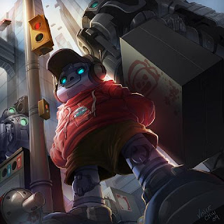
Some of the aspects that I find myself really liking about your work include both the amazing background detail you provide (for example, with the robot boy at the street corner), the interesting ‘angles’ you use vs. straight on shots (again using same picture as an example), and also the texture you include, one of my favorite being the Fire Giant from your D&D set. What I wanted to ask then were really two main questions in these regards:
Part 2 of 2 (link to Part 1)
Click any image to biggenize
 Vince, I’m curious: when you get an assignment then for a movie or let’s say even a video game for example with SEGA, how is the process set up? Do you continue to work from home in a ‘freelance’ mode or do you move to a different city and set up with the local ‘think tank’?
It’s sort of a mixed bag. With the project you mention, I was working full-time with Pseudo Interactive and Sega was the publisher on one of the projects. So I worked in a office with my other PI co-workers on this project. Sometimes I participated in meetings directly with the Sega people, but this was rare. Most of the information I got to work with came through my art lead and friend Ted Kim.
Like I said though, that gig came to an end. Since then, I’ve done mostly freelance assignments where I’ve been able to work mainly from home. Sure, it’s nice to get out now and then in order to interact with other creative people, you know, work as part of a team with your peers. There’s a certain vibe I find in that kind of environment that can just energize the whole atmosphere. But it’s also nice to be in a familiar environment and get settled down to work, especially those long projects.
Sometimes it really is a marathon – where even working from home you almost need to know how to pace yourself with the heavy workload.
 How does an illustrator wide up getting a ‘gig’ with a movie or video game production? Are you out there really pushing your work to Hollywood or is there some kind of local representative you have or how does it happen exactly?
I can’t say I’ve been all that active in terms of really pushing my stuff out there. I’m just very lucky that I have talented friends who have given recommendations that bring me into projects and introduce me to the right people.
I also think being able to be flexible helps as well. I’ve come full circle in terms of doing things to get this point, that is, trying out and dabbling in all kinds of different stuff in the big world of Illustration. But I do believe equal parts networking and hard work go hand-in-hand ... and if you have that, then opportunities will eventually come your way.
 As I mentioned earlier, you’re a member of one of my own favorite illustrator collectives, namely ‘Sketch Motel Illustrators’. How important is being hooked up with a group like this to you and how close are you to your fellow compatriots that use this site? Do you ever find yourself, for example, ‘stuck’ in terms of a piece or some kind of detail and call up one of these other talented artists for suggestions or even direct help?
Yeah, I’m actually one of the newer members on Sketch Motel. But it’s definitely great exposure and also an honor to be included with talented peers. Also there’s a great pool of knowledge in that group. You mentioned Charlene Chui, who I know pretty well. I met her through the Street Fighter tribute book. I saw her Chunli entry and we started talking and we’ve been friends ever since.
On the other hand, I met Huan Tran through Ultimate Frisbee (he throws a
 mean Frisbee, and his team had just beaten our team!!). In fact, I had no idea Huan was an illustrator at the time, but I got to know him better through Charlene.
And oh yes, being ‘stuck’ on a piece is one of the most frustrating things you can have. So having a small army of extremely talented friends who can help get you out of that ditch is awesome. They help in so many ways, be it with fresh ideas, or recommendations on composition, you name it. You need that outside opinion at times, especially if you’ve been staring at something too long.
I also enjoy that you include videos of some of your sketching and production of different pieces. Why have you decided to share what I consider to be an almost ‘intimate’ side of your work and show people so much of your creative process in terms of tutorials and detailed sketch work? (ZN: click here to access Vince’s step-by-step creation of the brutish looking fellow shown below)
Hmm... well, I’ve never considered my process as all that intimate or even very secretive. At first, when I started making the videos, I was doing it more for my own personal growth, like an exercise. I figure if I recorded myself drawing, I could streamline my process and be more comfortable under time constraints.
 Over time, I had some people ask me for more details, so I tried to set up some more in-depth tutorials. But I’ve only recorded one with a voice-over, mostly because I’m not an audio engineer and thought it was kind of frustrating. I would like to do more, but I’m finding that recording the process and also doing the voice part makes it much more time-consuming than creating the image. Or at least it feels like it to me. Still, I would like to do more in the future, so we’ll see.
But I guess to sum up as to why I do it: it’s basically just a nice feeling when you’re around other creative people who like to share their ideas and processes and are just as passionate about what they do as you are. That’s the kind of community that inspires me. So I like to give back to others with this same kind of vibe that influences me so much.
Some of the aspects that I find myself really liking about your work include both the amazing background detail you provide (for example, with the robot boy at the street corner), the interesting ‘angles’ you use vs. straight on shots (again using same picture as an example), and also the texture you include, one of my favorite being the Fire Giant from your D&D set. What I wanted to ask then were really two main questions in these regards:
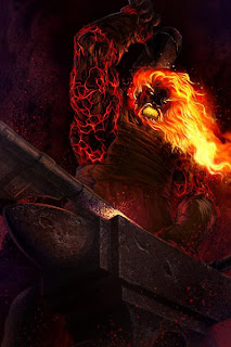
1) When you start a piece, do you already have a pretty good idea about all these factors in your mind, including the detail, texture and view angle – or does all this develop and form as the piece develops and forms?
2) And also, how do you know when it’s time to ‘stop’ adding on such features, and maintain your story without losing focus? I guess another way of saying this would be: how do you keep your illustrations still ‘simple’ enough not to distract the viewer?
Sometimes I do have a little bit of a rough idea. I’ll take it then into the drafting stage, you know as a rough set-up, and map it out to get all the essential items on paper. After that, I’ll try rearranging stuff, or changing perspective or other aspects. In a way, to me it’s kind of like rearranging a toy play-set just to get everything right and ready to go.
In terms of textures, I usually think of these pretty close to the end of painting, after I get all my tones laid out. Actually, lately after I get a drawing done, I think more about lighting than anything else. I’ve been looking at a lot of photography lately, and it’s really inspired me to try more illustration using unusual lighting and its effects. It gets me excited when I can push an illustration in that way!
Actually, in terms of when I ‘decide’ that something is done, well it’s more sometimes the deadlines I face saying its finished than me saying I’m done. But it’s actually a part of the process that I’m still figuring out. Eventually I would
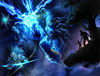 like to try to push the focus/unfocused details a little further, to create depth of field like photographers do. But again, there are the time restrictions to respect.
For now, I try to finish as much as I can earlier then my deadlines. This way I’ll have some time to get away from a piece and then be able to come back to it and look at it again with fresh eyes. I don’t always have the luxury to do that; but if possible, I like that little bit of breathing space to break it down and see if I need more attention in certain areas.
When you work on more ‘private’ pieces vs. say working on a project for one of the earlier mentioned outlets or even someone like the University of Tennessee, how does the creative process usually work? Do such people including like Knorr Foods or even Kodiak Boots come in and say ‘do this and this’ or do they still rely on your own creative input for suggestions?
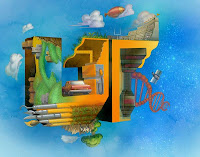 Those pieces for University of Tennessee and also Knorr were heavily directed by Jeremy Dimmock. I would say that these abstracts were already more detailed than any I had ever worked on in the past in terms of the art ‘style’. In these cases, I kind of just sat back a little in terms of the concept stages.
This is pretty true of any project I get. I usually try to wait until I can get stuff on paper and try to get my head wrapped into the original concept before I try to make any suggestions. I think in those cases, the roughs and thumbnails were really essential in order to work out how it might be rendered and fleshed out for the final pieces. And I think more or less it’s at this point when I start throwing out some of my own input.
If such clients do give you a lot of freedom, how many proposals would you typically bring to the table for discussion? You show for example a lot of different ‘character’ sketches on your web-site, and I’m just curious how this ultimately is presented to the customer for approval, fine-tuning or additional work?
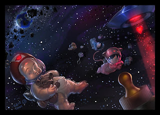 I find that with characters, the client tends to be more involved after the initial roughs. Yes, they give you room to play and see what you can bring to the table, and then they give you their own input. This is compared to more environmental concepts where they’re typically a lot more easier going, unless its game play related. In my experience, the rough stages of character work seem to be the most important parts, as opposed to environmental concepts where the focus is more on the final colored pieces.
A lot of the process including the re-working that is needed to reach what the customer wants is determined by budget, time and ultimately the desired style. Again, I usually like to have a good idea what a client is aiming for well before I start. And then I make a rough estimate on what I think will be required in terms of the approximate number of hours - or inversely, look to limit my time to fit their budget.
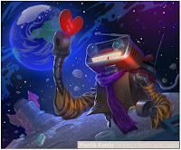 Also the amount of details/style can be a big factor, that is, on how many iterations I can do in the required amount of time. I find the more complicated and realistic a piece needs to be, the more time I need to work on designing. If the designs are let’s say a bit more ‘cartoony’, then the time needed to churn out a character is much less. But on the flip side, if there’s more room to play with in terms of looks and styles you can try out, this can also affect the time it takes especially if you get too many ideas.
But usually I gauge a time for myself in terms of the customer’s budget and their deadline. I usually do a breakdown of 3 iterations. The initial one is where I just try out everything and anything even if I think it’s silly (sometimes I find doing even the wackiest designs pays off). I’ll try to narrow it down if it looks too similar in look, silhouette, whatever. By the second iteration, I’ll address the designs based on feedback, and then alter, mix or create new designs (that I haven’t tried yet). Then either by the second or third batch, there will be a design that gets picked out or at least one that’s pretty close to what we’ll end up with. And then I’ll flesh it out in color once everything else is finalized.
 Your illustrations run a very wide range of different ‘topics’ (there should be a better word for that, but I'm having trouble concentrating with these darn voices) including weapons, robots (my own favorite, which I thought I’d mention again if it wasn’t clear to anyone yet!!), angry gods, monsters, sexy but dangerous women, video game characters, kids illustrations, high-tech mechanics, airport snack shops and so many dozens more. But for you, if you just have a few hours to do whatever you wanted to, what do you enjoy drawing most?
Oh that’s a tough one. If I had to narrow it down, it’s got to be people and robots, and even then in no particular order. In regards to people, I especially love drawing faces and noses (that sounds weird doesn’t it?). I prefer to create a facial expression and then have the body accent the face.
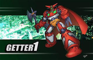 But aside from people, robots hit a soft spot for me. I guess it comes from my childhood (I’m guessing you’re the same way too, based on your question). I’m really fanatical about what kind of robot styles I like, too. I tend to favor more of the old school robot aesthetics i.e. Mazinger, Getter Robo G or Transformers (classic Generation 1). I also really like some of the more modern Asimo, Quiro. I really like it when robots kind of show off a personality through their designs vs. a more utilitarian design.
What area have you not worked in at all or would like to work more in?
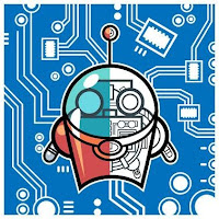 Oh definitely TOYS! I’ve dipped my hands in a little bit of initial design work, but that’s about it. I would love to do more of that.
Toys were such a big part of my childhood. Now I find that it’s pretty cool when you can see something that was rendered in 2D turned tangible. You can enjoy a design with more than your eyes: you can then touch it, feel the texture, even sometimes have sound. I guess maybe my childhood isn’t quite over after all!
Finally, what is something about Vince Chui that would make the rest of us – kids or even just those of us who are kids at heart – chuckle?
I believe that you should at least say either ‘bupkiss’, ‘will-nilly’, or ‘donkey wonky do’ to a stranger once a week.
ziggynixonziggynixonziggynixonziggynixon
 Vince Chui is an exceptionally talented young illustrator currently based in the Great White North (that’s Canada for all you Global Warming protesters out there). In his own words, he ‘draws stuff’ ... and what great stuff it is! His work includes an eclectic mix of illustration, concept art, story boards and much more. Vince has worked in worked in video games, advertising and the movie business (yes, that is, if you count ‘The Love Guru’ and ‘Land of the Lost’).
His client list ranges from Electronic Arts, Sega, Knorr Foods, Atomic Orange, Blazing Lizard Inc. and the Oxford University press, just to name a few. He has been featured in various publications including ‘Alberto Ruiz : Eye Candy Vol. 2’ and the ‘Udon Street Fighter Tribute book’.
Vince invites you to swing by and say hello on his blog, YouTube, dailymotion or even follow him on twitter (Editor’s Note: none of these inputs are an
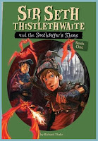 endorsement of not going out occasionally into the ‘real’ world and meeting people face-to-face). You can also follow him via the Sketch Motel or check out the new ‘kidchuckle’ store at zazzle.com, so freshly opened it still has that new car smell!! And don’t forget to head to the bookstores in September to pick up your copy of ‘Sir Seth Thistlethwaite and the Soothsayer’s Shoes’ by Richard Thake (geez, try saying all that three times fast!!!), which includes not only cover art by Vince but also the interior pieces!! It’ll have you sthpinning in your thseathts for thsure!!
Now if you’ll excuse me, I think I’m going to try and break my arm (again) by trying out the old skateboard! Aloha!!
ziggynixonziggynixonziggynixonziggynixon
All pictures, videos and other media are used with written permission of Vince Chui also referred to as ‘kidchuckle’, or are available in the public domain (noting copyright and other restrictions, accordingly). No further reproduction or duplication is permitted without contacting the artist directly.
Some pictures have been modified slightly or combined only for the purpose of space limitations.


No comments:
Post a Comment