An interview with Amanda Lee James
Part 1 of 2 (link to Part 2)
Click on any picture to giganticate
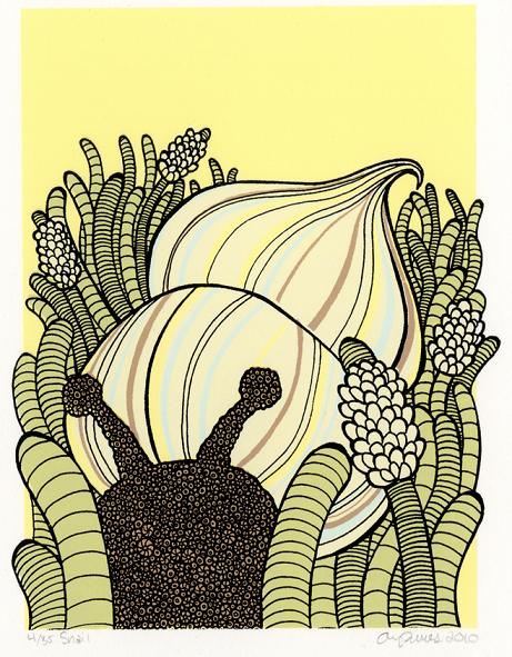
 Amanda Lee James – where I’ve added ‘Lee’ because Amanda James is apparently a fairly common name – is a young lady – noting she is indeed a lady despite what you might think from a first glance of her artwork (stop giving her a complex!) – that in her own words ‘loves to draw, loves to print and enjoys fine lines and seventies-inspired colours’. Her often meticulously textured designs capture many of the amazing creatures both found on land and in the sea – or perhaps ‘just’ in our imaginations as well.
My impression of a lot of Amanda’s work is that she takes a great big fuzzy ball of shag carpet and twists it around in amazing ways to give a great big bear or other distant mammalian cousin! Her illustrations can appear to be candies combined together (even literally as you’ll see) that leaves one with the impression of floating along underwater in a classic Jacques Cousteau documentary! And who knows: maybe you’ll insist – as my son did AGAIN during the read-out check of this article – that she uses gummy worms to make her stories come to life!! Whatever you believe, you MUST make a bee-line to her site to check out ALL of these prints in large size to do them full justice!
Key is that this Portland-based (for now) artist also compliments her sublime skills and obvious talents with her uniquely deft touch as a print-maker! Now that’s definitely something you don’t see very much of these days! Ziggy Nixon is pleased to have caught up with Amanda shortly before she heads off on the next exciting stage of her personal and artistic journey!
ziggynixonziggynixonziggynixon
Hi Amanda, welcome! Can you tell us a little bit about how you became interested in illustration please?
I’ve always been interested in illustration in some form. I wanted to be an animator as soon as I was old enough to know that it was indeed people that created and drew my favourite cartoons. I also wanted to illustrate the back of cereal boxes and draw pictures for books. I’d always be trying to come up with my own little characters and making flip books and that kind of thing.
Part 1 of 2 (link to Part 2)
Click on any picture to giganticate
 Amanda Lee James – where I’ve added ‘Lee’ because Amanda James is apparently a fairly common name – is a young lady – noting she is indeed a lady despite what you might think from a first glance of her artwork (stop giving her a complex!) – that in her own words ‘loves to draw, loves to print and enjoys fine lines and seventies-inspired colours’. Her often meticulously textured designs capture many of the amazing creatures both found on land and in the sea – or perhaps ‘just’ in our imaginations as well.
My impression of a lot of Amanda’s work is that she takes a great big fuzzy ball of shag carpet and twists it around in amazing ways to give a great big bear or other distant mammalian cousin! Her illustrations can appear to be candies combined together (even literally as you’ll see) that leaves one with the impression of floating along underwater in a classic Jacques Cousteau documentary! And who knows: maybe you’ll insist – as my son did AGAIN during the read-out check of
 this article – that she uses gummy worms to make her stories come to life!! Whatever you believe, you MUST make a bee-line to her site to check out ALL of these prints in large size to do them full justice!
Key is that this Portland-based (for now) artist also compliments her sublime skills and obvious talents with her uniquely deft touch as a print-maker! Now that’s definitely something you don’t see very much of these days! Ziggy Nixon is pleased to have caught up with Amanda shortly before she heads off on the next exciting stage of her personal and artistic journey!
ziggynixonziggynixonziggynixon
Hi Amanda, welcome! Can you tell us a little bit about how you became interested in illustration please?
I’ve always been interested in illustration in some form. I wanted to be an animator as soon as I was old enough to know that it was indeed people that created and drew my favourite cartoons. I also wanted to illustrate the back of
 cereal boxes and draw pictures for books. I’d always be trying to come up with my own little characters and making flip books and that kind of thing.
I first got serious about it when I went to college for art. I feel like it really pushed me to think about art making in a serious way. But about midway through my education, I realised that telling a simple story was more important to me than making some kind of giant political or social statement like many of my peers were into. That’s when I first began identifying with being an “illustrator”.
Later, when I got into printmaking, my interest in narrative grew even stronger because it’s naturally such a graphic medium.
Maybe it just has to do with my exposure to the artform, but ‘printmaking’ seems to be a pretty rarely practiced craft these days. How did your work in this application come about?
 I didn’t know what printmaking was until I stepped into my ‘Intro to Relief’ class during the end of my second year of undergraduate school. But I quickly found out that it was a very natural fit for me!
I love making tiny marks and I love repetitive tasks. All of the process that is involved in making images-in-multiples reminded me of drawing different frames in animation. I also loved how tactile the medium was. I liked that every colour had to be done separately and applied in layers.
I think that in a world of iPhones, electronic readers and the Internet, touching paper and applying every colour individually by hand can be really refreshing. I’m also incredibly drawn to printmaking because of it’s such a social art form. I get to go to the studio every day and hang out with a bunch of fun people and make beautiful things! I’ve never felt that kind of camaraderie using other art forms.
If I understand correctly, your work is all done by hand and then you typically produce the final products by silk-screen. Do you also work with computer aided tools at all – even for assistance – or do you prefer the more ‘organic’ approach of pen and/or squeegee on paper?
 All of my drawings are done purely by hand. I even use books for my reference material, rather than conduct a Google image search. This is simply because I enjoy the tangibility of flipping through the pages of books.
In the printing process, I do use a copy machine to resize some of my images. I like the ability to see my drawings in a variety of sizes and use blown up pieces for patterned backgrounds. That is the only “technology” that I use while making my prints. I try to keep it as purely handmade as possible.
Speaking of silk-screen, noting my own experiences in the past may have scarred me somewhat, but my recollection is that this can be a difficult process to master. This is true not only in terms of getting colour onto your final material but also in translating your designs onto/into the screens themselves. I would think then that with the amount of finely textured and exquisite detail in your works that this could especially be the case. Do you have to deal with issues like this or has it been a pretty successful tool so far?
 I have had a fairly smooth experience with screen-printing.
In the beginning there was quite a bit of experimenting. It was hard to find the right screen mesh count to produce highly detailed images while still letting enough ink through to get a solid line. I also struggled with finding a copy machine that would consistently have enough toner to get the image to transfer correctly.
Despite those factors, I think that it performs better than any other medium for my images in its ability to hold crisp detail and print bright colours.
Is silk-screen a costly approach to reproduce your limited prints or is that manageable?
 Silk-screen has been perfectly manageable for my prints. I can reuse the same screens over and over again so in large part my only costs are paper and inks. At this point it’s more affordable for me than going digital.
I also love using this medium because it doesn’t produce as much waste as etching or relief and I can use less toxic water-based inks.
I found the following statement very interesting: ‘The beauty of repetition is something I’ve constantly been intrigued by.’ Why do you think that you are so attracted to repetitive and such finely defined patterns?
It’s hard to say. As far as making repetitive patterned works, I think that I have a bit of an obsessive personality. I find repetition to be extremely comforting and meditative.

I’ve always absent-mindedly doodled little patterns. So in this body of work I’m learning to control the doodles and build up form from them. As far as repetitive detail as an aesthetic, it’s just something that has always drawn my eye.
 In the same section on your home website, you said ‘... I started to question if something conventionally ugly could become beautiful if it were repeated and patterned.’ What is your conclusion so far to this ‘theory’? Do you ever have a piece where you just have to kind of break away and say ‘no, that’s not working’?
I typically always try to finish any drawing that I start because I don’t usually like them until they are completely finished. So it’s really hard to tell what’s working or not early on.
 Still, like anyone I have a lot of drawings that end up “not working” and I typically just don’t end up turning them into prints. But pieces of them can become useful as backgrounds for more successful drawings. To answer your question, so far the theory has held pretty true as far as directly repeating a small and simple pattern.
Lately, I have been experimenting with random clusters of small patterns to make a bigger irregular tessellation of sorts. A lot of these haven’t been as successful but I’m still working on it.
I’m also wondering if you have an affinity for other materials that have perhaps influenced your style, ranging even from ‘classical’ wallpaper patterns or even yarn?
 I’m pretty sure I have an affinity towards almost every material. I love the look and feel of different textures and objects. I like that the same shapes can look completely different depending on their materials.
The yarn-like textures I use remind me more of worms – but I suppose yarn kind of looks like colourful worms anyway. And yes, I have a strong love for classical wallpaper.
As one reviewer phrased it, your work is ‘meticulously textured’ and to me there certainly does NOT appear to be any evidence of you taking ‘short-cuts’. With that in mind, how long does it take you to create a piece? Does the amount of attention it takes just exhaust you sometimes?
 A drawing will take me anywhere from 12 to 60 hours depending on the scale and how detailed it is. Sometimes – especially if I am working towards a deadline – this can be a bit exhausting but typically I find it very enjoyable.
To manage everything, I try to break the drawing up. If I feel that I am starting to get burnt out on a drawing, I switch to printing for a while. My printing process is very fast and physical so it’s really a good contrast to the drawing. They kind of balance each other out.
Continued in Part 2
Later, when I got into printmaking, my interest in narrative grew even stronger because it’s naturally such a graphic medium.
Maybe it just has to do with my exposure to the artform, but ‘printmaking’ seems to be a pretty rarely practiced craft these days. How did your work in this application come about?
 I didn’t know what printmaking was until I stepped into my ‘Intro to Relief’ class during the end of my second year of undergraduate school. But I quickly found out that it was a very natural fit for me!
I love making tiny marks and I love repetitive tasks. All of the process that is involved in making images-in-multiples reminded me of drawing different frames in animation. I also loved how tactile the medium was. I liked that every colour had to be done separately and applied in layers.
I think that in a world of iPhones, electronic readers and the Internet, touching paper and applying every colour individually by hand can be really refreshing. I’m also incredibly drawn to printmaking because of it’s such a social art form. I get to go to the studio every day and hang out with a bunch of fun people and make beautiful things! I’ve never felt that kind of camaraderie using other art forms.
If I understand correctly, your work is all done by hand and then you typically produce the final products by silk-screen. Do you also work with computer aided tools at all – even for assistance – or do you prefer the more ‘organic’ approach of pen and/or squeegee on paper?
 All of my drawings are done purely by hand. I even use books for my reference material, rather than conduct a Google image search. This is simply because I enjoy the tangibility of flipping through the pages of books.
In the printing process, I do use a copy machine to resize some of my images. I like the ability to see my drawings in a variety of sizes and use blown up pieces for patterned backgrounds. That is the only “technology” that I use while making my prints. I try to keep it as purely handmade as possible.
Speaking of silk-screen, noting my own experiences in the past may have scarred me somewhat, but my recollection is that this can be a difficult process to master. This is true not only in terms of getting colour onto your final material but also in translating your designs onto/into the screens themselves. I would think then that with the amount of finely textured and exquisite detail in your works that this could especially be the case. Do you have to deal with issues like this or has it been a pretty successful tool so far?
 I have had a fairly smooth experience with screen-printing.
In the beginning there was quite a bit of experimenting. It was hard to find the right screen mesh count to produce highly detailed images while still letting enough ink through to get a solid line. I also struggled with finding a copy machine that would consistently have enough toner to get the image to transfer correctly.
Despite those factors, I think that it performs better than any other medium for my images in its ability to hold crisp detail and print bright colours.
Is silk-screen a costly approach to reproduce your limited prints or is that manageable?
 Silk-screen has been perfectly manageable for my prints. I can reuse the same screens over and over again so in large part my only costs are paper and inks. At this point it’s more affordable for me than going digital.
I also love using this medium because it doesn’t produce as much waste as etching or relief and I can use less toxic water-based inks.
I found the following statement very interesting: ‘The beauty of repetition is something I’ve constantly been intrigued by.’ Why do you think that you are so attracted to repetitive and such finely defined patterns?
It’s hard to say. As far as making repetitive patterned works, I think that I have a bit of an obsessive personality. I find repetition to be extremely comforting and meditative.
I’ve always absent-mindedly doodled little patterns. So in this body of work I’m learning to control the doodles and build up form from them. As far as repetitive detail as an aesthetic, it’s just something that has always drawn my eye.
 In the same section on your home website, you said ‘... I started to question if something conventionally ugly could become beautiful if it were repeated and patterned.’ What is your conclusion so far to this ‘theory’? Do you ever have a piece where you just have to kind of break away and say ‘no, that’s not working’?
I typically always try to finish any drawing that I start because I don’t usually like them until they are completely finished. So it’s really hard to tell what’s working or not early on.
 Still, like anyone I have a lot of drawings that end up “not working” and I typically just don’t end up turning them into prints. But pieces of them can become useful as backgrounds for more successful drawings. To answer your question, so far the theory has held pretty true as far as directly repeating a small and simple pattern.
Lately, I have been experimenting with random clusters of small patterns to make a bigger irregular tessellation of sorts. A lot of these haven’t been as successful but I’m still working on it.
I’m also wondering if you have an affinity for other materials that have perhaps influenced your style, ranging even from ‘classical’ wallpaper patterns or even yarn?
 I’m pretty sure I have an affinity towards almost every material. I love the look and feel of different textures and objects. I like that the same shapes can look completely different depending on their materials.
The yarn-like textures I use remind me more of worms – but I suppose yarn kind of looks like colourful worms anyway. And yes, I have a strong love for classical wallpaper.
As one reviewer phrased it, your work is ‘meticulously textured’ and to me there certainly does NOT appear to be any evidence of you taking ‘short-cuts’. With that in mind, how long does it take you to create a piece? Does the amount of attention it takes just exhaust you sometimes?
 A drawing will take me anywhere from 12 to 60 hours depending on the scale and how detailed it is. Sometimes – especially if I am working towards a deadline – this can be a bit exhausting but typically I find it very enjoyable.
To manage everything, I try to break the drawing up. If I feel that I am starting to get burnt out on a drawing, I switch to printing for a while. My printing process is very fast and physical so it’s really a good contrast to the drawing. They kind of balance each other out.
Continued in Part 2