An Interview With Designer Brandon Peat
Part 1 of 2 (link to Part 2)
Click on any picture to enlargify
 Brandon Peat always seems to be smiling. For example, looking for various images including a potential profile picture to use, I found him doing something fun or goofy like kneeling before Imperial Stormtroopers (‘these ARE the clever guys we’re looking for! Rebel scum...’) or smiling with friends or family. Heck, he even illustrates himself sporting a whimsical smile – as well as a killer beard and fluffy full head of hair (yes, I notice these things... more and more, sadly) – for his homepage or other self-promotional pictures.
And why shouldn’t he be smiling? Along with being a relatively new father (‘Three-Peat’!), Brandon is also having fun as a relatively new freelance graphic designer who is making in-roads in several areas. He’s got an exciting portfolio up to enjoy, he offers a wide range of skills and services, plus he has some ‘just for fun’ (+/-) projects going on with some pals that will keep him a mainstay of some of the more popular ‘cons’ for years to come!
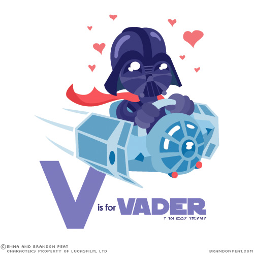
You’ve probably heard of Brandon already without maybe quite knowing it. He – and his talented wife Emma – recently made a big splash on the Interweb scene with their ‘A is For Ackbar’ alphabet book designed for their son. Although not an official income- generating project by any stretch of the imagination, it certainly struck a cord with many folks who seem to drive a non-ending industry of Star Wars based memes and cross-over tee-shirt ideas. But having said that, it was / is obvious to us that Brandon’s talents go way beyond this ‘educational exercise’.
As such, we’re happy to present this young man’s work and stop and have a chat with him on his way ‘to the stars’... oops, we did it again, huh? Blast it, it must be a trap!! Aaarrgh... let’s force our way onward, OK? Groooaaannn...
ziggynixonziggynixonziggynixon
Welcome Brandon! Can you tell us a little bit about what you’re working on these days and your background please? What inspired you to become an artist-slash-designer?
 Thanks Ziggy, good to be here!
As always, I’m working on a little bit of everything – a website design, a tattoo illustration, the GUI for an iPhone app, and of course updates to my own website and portfolio.
In terms of my background, I had always been interested in art, but it wasn’t until late high school that I decided to pursue a career in graphic design.
Design was the most interesting form of art, to me – you’re trying to make it aesthetically pleasing, yes, but you’re also trying to convey a certain message or work within a set medium. It’s art-based problem solving, which means it’s a far less subjective discipline than “fine” art. There are bad solutions, good solutions, and maybe even one best solution, which is a very appealing and motivating idea to me.
 Jumping right into the Grade A, Parental Unit type questions: What prompted you to incorporate yourself as an independent ‘LLC’ agency and return to freelance work? You decided to do this relatively quickly after your experience as an Art Director and Interactive Developer at a local ad agency, didn’t you?
Yeah. I was hired a few months after graduating college at an ad agency in Fort Wayne, Indiana. I worked for them for two and a half years while doing a little freelance on the side from time to time.
 I decided to go full-time freelance for several reasons. Greater creative freedom was definitely the driving motivator, as was greater upward mobility for both my career and salary. You see, I had been hired as a print designer, but during my tenure there I did a lot of on-the-job learning and moved into a multimedia designer/developer role – a far more valuable and marketable position. However, the agency didn’t seem to have long-term plans for a multimedia department and I didn’t foresee any opportunity for a raise or promotion. That was December 2009, when the American economy was at a pretty low ebb.
 Conventional wisdom would seem to argue against quitting your job at such a time. But I perceived (correctly) that with the economic downturn, individuals and corporations would re-evaluate their established advertising and design strategies, and look to trim their budgets however possible. A poor economy is actually a great economy for freelancers, because we can operate at a much lower cost than larger agencies – a very attractive selling point for cash-strapped businesses.
So I went into business for myself on January 1st, 2010. I officially incorporated fairly quickly after that – though I hadn’t initially thought about doing so. The primary impetus was tax season. Self-employed individuals are required to file quarterly returns, so when I took my first freelance quarter income sheets to my accountant, we looked at my projected income/expenses for the year and he advised me to incorporate.
If you’re doing even halfway decent on income, incorporating as an LLC could save you several thousand dollars on your returns, plus you only have to file annually. I would definitely recommend that any self-employed individual meet with an accountant and see how best to hang onto your income!
 I’m curious as well how you best promote yourself as a ‘jack of all trades’? Is there some trade-off in terms of being able to offer so many services vs. being seen as a ‘specialist’ in a given area?
That’s the stigma, yeah – the old adage is that “a jack of all trades is a master of none.” But I don’t think that holds true at all in the design world.
Graphic designers, by the nature of our job, have to be multitalented, able to work with different mediums, styles, and content. Our goal is to develop a unique look for each client, after all, so we don’t want to be good at just one thing. Every designer who went to college for print-based design is already skilled in a wide variety of disciplines such as layout, illustration, logo development, and photography. And though web and multimedia are different mediums, they operate on the same principles as any other area of design, and are in ever-increasing demand. In this day and age, a designer who doesn’t at least have some basic multimedia know-how risks being left behind.
As you mentioned, I do promote myself as a ‘one-stop shopping’ design destination. That’s because I have a very diverse skillset rivalling what you might find across a typical ad agency. I’m well-versed in traditional design disciplines such as illustration, logo and brand development, and print layout.
 I also specialise in multimedia ventures such as website design and development, and even video/animation with such programs as Flash, After Effects, and Final Cut Pro. I am a skilled writer/proofreader and am completely comfortable meeting with clients or giving presentations, having been an award-winning member of my high school and college speech teams.
The reason I can successfully operate as a one-man operation is precisely because I do have such a wide skillset “in-house.” I don’t advertise a service that I don’t in turn specialise in.
When you have a client that may need more than your current skill-set allows you to offer, do you ‘shop out’ to other professionals in the area or within your networking base?
Absolutely, though this doesn’t happen often. Whenever possible, I will learn whatever is needed to win the work and make it shine.
 This past Thanksgiving, your ‘career’ took a very special turn as you and your wife added ‘parenthood’ to your list of achievements! Congratulations! How has becoming a first-time father at least started to affect your creative process or work, if at all? Granted, I know the lad isn’t perhaps old enough to start using your pens to create wall murals (just wait!!), but still...
Since I work mostly from home, being a dad is both awesome and difficult. I love love love being around for so much of Tycho’s early development, helping to take care of him, etc., which is something that a lot of day-job dads can’t do.
On the flip side, that means I have to focus on my work with the distraction of a crying – or even worse, an adorably cooing baby – which can be very tough at times. You definitely get a lot more adept at multitasking and doing work with just one hand.
 It was also during the ‘run up’ to Tycho Maximus’ birth (what a fantastic name!), that you and Emma developed together the project that has undoubtedly gained you the most exposure, namely, the ‘A is for Ackbar’ alphabet collection (fans, you MUST click on the image that starts Part 2 to see all the characters in their full fantastic glory)! Now I don’t wish to beat this well-documented project to death, but just humour me with a couple of questions, please:
I understand that you did the sketching for the project, with your talented artist wife doing the ‘conversion’ into Illustrator. How often have or do the two of you still collaborate on at least design projects together (noting that, yes, I understand the mechanics behind at least the parental collaboration bit...)?
Haha, yes. My wife, Emma, is also a graphic designer, and it’s great being married to someone in your discipline – they don’t just empathise with your stresses, but actually understand them. It’s also nice to have a knowledgeable expert under the same roof as a sounding board.
 Of course, two opinionated artists won’t always see eye to eye, and we have very different design sensibilities. So there’s bound to be occasional head-butting. It’s also the reason Emma and I don’t directly collaborate together as much as we simply consult each other, like we did here as well on this ‘Cowboy Bebop’ picture.
We’ve discovered that art is the one thing we will argue about. In fact, we argued so much about how to execute the Ackbar project that it almost didn’t happen! But you learn how to overcome disagreements like that in marriage, or at least you should.
Continued in Part 2 ‘The Empire Strikes Brandon’...
Part 1 of 2 (link to Part 2)
Click on any picture to enlargify
 Brandon Peat always seems to be smiling. For example, looking for various images including a potential profile picture to use, I found him doing something fun or goofy like kneeling before Imperial Stormtroopers (‘these ARE the clever guys we’re looking for! Rebel scum...’) or smiling with friends or family. Heck, he even illustrates himself sporting a whimsical smile – as well as a killer beard and fluffy full head of hair (yes, I notice these things... more and more, sadly) – for his homepage or other self-promotional pictures.
And why shouldn’t he be smiling? Along with being a relatively new father (‘Three-Peat’!), Brandon is also having fun as a relatively new freelance graphic designer who is making in-roads in several areas. He’s got an exciting portfolio up to enjoy, he offers a wide range of skills and services, plus he has some ‘just for fun’ (+/-) projects going on with some pals that will keep him a mainstay of some of the more popular ‘cons’ for years to come!
You’ve probably heard of Brandon already without maybe quite knowing it. He – and his talented wife Emma – recently made a big splash on the Interweb scene with their ‘A is For Ackbar’ alphabet book designed for their son. Although not an official income-
 generating project by any stretch of the imagination, it certainly struck a cord with many folks who seem to drive a non-ending industry of Star Wars based memes and cross-over tee-shirt ideas. But having said that, it was / is obvious to us that Brandon’s talents go way beyond this ‘educational exercise’.
As such, we’re happy to present this young man’s work and stop and have a chat with him on his way ‘to the stars’... oops, we did it again, huh? Blast it, it must be a trap!! Aaarrgh... let’s force our way onward, OK? Groooaaannn...
ziggynixonziggynixonziggynixon
Welcome Brandon! Can you tell us a little bit about what you’re working on these days and your background please? What inspired you to become an artist-slash-designer?
As always, I’m working on a little bit of everything – a website design, a tattoo illustration, the GUI for an iPhone app, and of course updates to my own website and portfolio.
In terms of my background, I had always been interested in art, but it wasn’t until late high school that I decided to pursue a career in graphic design.
Design was the most interesting form of art, to me – you’re trying to make it aesthetically pleasing, yes, but you’re also trying to convey a certain message or work within a set medium. It’s art-based problem solving, which means it’s a far less subjective discipline than “fine” art. There are bad solutions, good solutions, and maybe even one best solution, which is a very appealing and motivating idea to me.
 Jumping right into the Grade A, Parental Unit type questions: What prompted you to incorporate yourself as an independent ‘LLC’ agency and return to freelance work? You decided to do this relatively quickly after your experience as an Art Director and Interactive Developer at a local ad agency, didn’t you?
Yeah. I was hired a few months after graduating college at an ad agency in Fort Wayne, Indiana. I worked for them for two and a half years while doing a little freelance on the side from time to time.
 I decided to go full-time freelance for several reasons. Greater creative freedom was definitely the driving motivator, as was greater upward mobility for both my career and salary. You see, I had been hired as a print designer, but during my tenure there I did a lot of on-the-job learning and moved into a multimedia designer/developer role – a far more valuable and marketable position. However, the agency didn’t seem to have long-term plans for a multimedia department and I didn’t foresee any opportunity for a raise or promotion. That was December 2009, when the American economy was at a pretty low ebb.
 Conventional wisdom would seem to argue against quitting your job at such a time. But I perceived (correctly) that with the economic downturn, individuals and corporations would re-evaluate their established advertising and design strategies, and look to trim their budgets however possible. A poor economy is actually a great economy for freelancers, because we can operate at a much lower cost than larger agencies – a very attractive selling point for cash-strapped businesses.
So I went into business for myself on January 1st, 2010. I officially incorporated fairly quickly after that – though I hadn’t initially thought about doing so. The
 primary impetus was tax season. Self-employed individuals are required to file quarterly returns, so when I took my first freelance quarter income sheets to my accountant, we looked at my projected income/expenses for the year and he advised me to incorporate.
If you’re doing even halfway decent on income, incorporating as an LLC could save you several thousand dollars on your returns, plus you only have to file annually. I would definitely recommend that any self-employed individual meet with an accountant and see how best to hang onto your income!
 I’m curious as well how you best promote yourself as a ‘jack of all trades’? Is there some trade-off in terms of being able to offer so many services vs. being seen as a ‘specialist’ in a given area?
That’s the stigma, yeah – the old adage is that “a jack of all trades is a master of none.” But I don’t think that holds true at all in the design world.
Graphic designers, by the nature of our job, have to be multitalented, able to work with different mediums, styles, and content. Our goal is to develop a unique look for each client, after all, so we don’t want to be good at just one thing. Every designer who went to college for print-based design is already skilled in a wide variety of disciplines such as layout, illustration, logo development, and photography. And though web and multimedia are different mediums, they
 operate on the same principles as any other area of design, and are in ever-increasing demand. In this day and age, a designer who doesn’t at least have some basic multimedia know-how risks being left behind.
As you mentioned, I do promote myself as a ‘one-stop shopping’ design destination. That’s because I have a very diverse skillset rivalling what you might find across a typical ad agency. I’m well-versed in traditional design disciplines such as illustration, logo and brand development, and print layout.
 I also specialise in multimedia ventures such as website design and development, and even video/animation with such programs as Flash, After Effects, and Final Cut Pro. I am a skilled writer/proofreader and am completely comfortable meeting with clients or giving presentations, having been an award-winning member of my high school and college speech teams.
The reason I can successfully operate as a one-man operation is precisely because I do have such a wide skillset “in-house.” I don’t advertise a service that I don’t in turn specialise in.
When you have a client that may need more than your current skill-set allows you to offer, do you ‘shop out’ to other professionals in the area or within your networking base?
Absolutely, though this doesn’t happen often. Whenever possible, I will learn whatever is needed to win the work and make it shine.
 This past Thanksgiving, your ‘career’ took a very special turn as you and your wife added ‘parenthood’ to your list of achievements! Congratulations! How has becoming a first-time father at least started to affect your creative process or work, if at all? Granted, I know the lad isn’t perhaps old enough to start using your pens to create wall murals (just wait!!), but still...
Since I work mostly from home, being a dad is both awesome and difficult. I love love love being around for so much of Tycho’s early development, helping to take care of him, etc., which is something that a lot of day-job dads can’t do.
On the flip side, that means I have to focus on my work with the distraction of a crying – or even worse, an adorably cooing baby – which can be very tough at times. You definitely get a lot more adept at multitasking and doing work with just one hand.
 It was also during the ‘run up’ to Tycho Maximus’ birth (what a fantastic name!), that you and Emma developed together the project that has undoubtedly gained you the most exposure, namely, the ‘A is for Ackbar’ alphabet collection (fans, you MUST click on the image that starts Part 2 to see all the characters in their full fantastic glory)! Now I don’t wish to beat this well-documented project to death, but just humour me with a couple of questions, please:
I understand that you did the sketching for the project, with your talented artist wife doing the ‘conversion’ into Illustrator. How often have or do the two of you still collaborate on at least design projects together (noting that, yes, I understand the mechanics behind at least the parental collaboration bit...)?
Haha, yes. My wife, Emma, is also a graphic designer, and it’s great being married to someone in your discipline – they don’t just empathise with your stresses, but actually understand them. It’s also nice to have a knowledgeable expert under the same roof as a sounding board.
 Of course, two opinionated artists won’t always see eye to eye, and we have very different design sensibilities. So there’s bound to be occasional head-butting. It’s also the reason Emma and I don’t directly collaborate together as much as we simply consult each other, like we did here as well on this ‘Cowboy Bebop’ picture.
We’ve discovered that art is the one thing we will argue about. In fact, we argued so much about how to execute the Ackbar project that it almost didn’t happen! But you learn how to overcome disagreements like that in marriage, or at least you should.
Continued in Part 2 ‘The Empire Strikes Brandon’...
No wait, that was Part V, wasn’t it? I never could follow that...