Showing posts with label cool. Show all posts

January 29, 2011

So A Talented Graphic Artist Walks Into A Bar ...

An Interview with Graphic Artist Steve Dressler

Part 1 of 2 (link to Part 2)
Click on any picture to embiggify to original size

One of my first impressions about
Steve Dressler was simply: ‘wow, this guy is having fun!’ Sure, that leaves a lot open to interpretation about one’s definition of fun, but consider
a) he’s ‘out there’ making a real name
for himself with his quirky yet highly stylized illustrations and other designs;
b) he performs stand-up comedy w
ith, among others, the ultra-hilarious troupe known as ‘The Upright Citizens’ Brigade’ or UCB or UCBW or even just ‘those funny folks down on 26th Street’;
c) and he has an array of talents that he’s only scratched the s
urface of, ranging from photography, sculpture, web design, fine art and more!

Plus, he’s worked with musicians,
writers and other neat folks, plying his trade in two of the world’s most exciting places to be, namely, Green Bay and Pittsburgh. Sorry, what? Oh my bad, that’s the upcoming Super Bowl match-up. I meant to say L.A. and New York!! And if that’s not enough for the cynics out there, he only days ago helped some schlub named Ziggy Nixon ‘tighten up’ his blog header ... and if that’s not a ticket to fame, then I don’t know what is!!

Now before I go any further in scaring you away with my own brand of Grade-Q non-professional humor, let’s dive in and get to know this unique craftsman:

ziggynixonziggynixonziggynixon

Steve, welcome! Can you tell us a little bit about Steve Dressler please and how he became the interesting man-of-many-trades that he is today?
Its kind of hard to pinpoint exactly how I became this guy, but here goes...

I’ve always loved to draw. My mom was a teacher, so we had plenty of arts and craft supplies in the house. When I was in elementary school, I found that my drawing skills made me special. I sucked at sports, and wasn't super-popular either, so I had to make the most of it. I remember creating lots of drawings as gifts in an effort to make friends. I also put a lot more work into book report covers and dioramas, rather than studying Social Studies or Language Arts.

In addition, my father worked with computers for Bell Labs, so we always had a computer in the house when I was a kid. We never had a Coleco, Nintendo or Sega, we just had a PC. So I played around a lot with layout programs like Print Shop and Print Master. I used whatever the equivalent of Microsoft Paint was on a Commodore 64!

We were even lucky enough to have this Okidata color printer, in an age where that was pretty darn rare. I wish I still had any of those original files or prints, but they're lost to the messiness of adolescence. As I got older, of course, computers got better and so did the programs. I kept playing with those programs like video games. I have vivid memories of spending hours and hours using Photoshop 4.

On top of all that, I collected baseball cards quite seriously. I fell in love with the graphic design (and value) of the vintage cards. I also collected Swatch watches and would spend hours designing my own. Add to that my love of skateboarding culture and all the cool ads in
Thrasher along with some serious graffiti-watching on drives to the Bronx to visit my grandparents. Last, but not least, there was TELEVISION. From Saturday morning cartoons to Saturday Night Live, from Hanna Barbera to SCTV, I have always been in love with most things TV.

I love how many of your pieces are steeped in a retro-/pop-, or as you put it, vintage or old-timey feel! I even found myself thinking ‘hm, so this is the kind of thing Warhol would be doing today if he were still alive’ (oh and loved the
Tale of Two Andy’s pic on your blog [incl. Warhol and Kaufman for those not in the know])! Is this style a target or a particular passion of yours or how has it come about?
It has been both deliberate and subconscious. I remember when I was a kid being aware of Warhol and the Campbell's Soup and Brillo Boxes. I totally "got it" but didn't think it was anything other than a super-interesting guy getting away with appreciating pre-existing things. I truly enjoyed everything he did. His visual language was the same one I could appreciate.

Me? I stared at gas station logos. I looked at the way the printers didn't line up the yellow plate on the box of cereal. I would stare at posters in the butcher window and geek out on the typography and color of ink. And as I got older, I studied the 60's pop movement quite heavily and fell in love with
Roy Lichtenstein and Robert Rauschenberg. I really dug Lichtenstein for his skill in actually painting the panels, as opposed to silk-screen, and his sense of humor in choice of imagery stuck with me. Rauschenberg blew my mind with his choices in what defined art. I wouldn't explore that on my own until senior year in college, but I had that idea in my head when I was a teenager.
You’ve referred to your illustration as ‘(creating) images that hold vintage elements while exploring forward thinking design.’ How do you maintain this attitude in your work?
The vintage elements are built into my visual vocabulary. I've always had an affinity for antiques and ephemera. I can walk down a city street, see some old tattered box in a dumpster, and happily walk away with a piece of the paper label. Later I'll translate what I get from that scrap, using color and typography to help tell a story.

The "forward thinking" part comes from my desire to infuse a bit of wit and pathos into whatever the end product's ultimate message is.

Can you describe how pop culture, current events or even other cultural icons influence not only your art but your daily ‘philosophy’ about life and, um, stuff?
I celebrate pop culture for all it’s bubble-gum aspects. I love that we are a visual culture. I love that we are voyeurs and narcissists.

The problem is that I see pop culture as recent as 15 years ago as a whole lot more charming and steeped in subcultures and phenomena. Musicians could still be somewhat ugly. Paparazzi photos were limited to the supermarket checkout counter. Looking at the world today, it just seems like a big commercial for about 5 or 6 corporations at times. It’s a lot different. That may be why the culture of today looks backwards so quickly. Things are getting confusing. 24 hour news cycles leave no time for posterity.

Somewhat tangential, yet an interesting perspective on pop culture: my brother went to Brown University in the early 90's. I would visit him and see Providence, Rhode Island all covered in ‘Andre The Giant’ stickers. I collected all the logo parodies I could peel off lamp-posts and phone-booths. In fact, in 1998 I did my term paper on Shepard Fairey for a Public Art class at Parsons. Through a chain of a few people I was able to trade a couple of phone calls and care packages with Shepard.

The gist of my paper had a lot to do with his creation of a recognizable mascot that held no real meaning. By this time, Shepard had started the Obey branding and was starting to pull jobs from much bigger clients. Fast forward to the present: Shepard is one of the most notable artists of the 21st century. He's great. He literally branded Obama. The similarities in what he did for OBEY and HOPE are exactly what pop culture is about.

How's that for philosophy? Meh.

Comedy obviously plays an important role in your life. How has performing live on stage or even in front of the camera affected your art approach? How about that in reverse (let’s try this: how has your art affected your comedy? Hang on... yeah, that looks right)?
That's two different questions. Let's see...

1) Performing comedy has affected my art by instilling in me a freedom to explore whatever I enjoy. With improv comedy, you trust you and your partner's choices and work towards finding resolution. I guess that philosophy has carried over into my art.

The difference between a blank page and an empty stage is the audience. Most times its easier to approach an empty stage!

2) My art has affected my "comedy" in a couple of ways. I have done a number of bits based around my parody Photoshop work. For example, in one bit I did a monthly talk show loosely centered around hipsters, where I stood onstage and took the role of a court sketch artist during the performances. I doodled the topics of conversation and punch-lines of the guest stand-ups. That was probably the closest marriage of the two.

I also did a speed-painting sketch one time that started as a portrait of Ray Charles but resulted in a portrait of Hitler.

The use of parody is obviously important to both your comedic and your design endeavours. However, is there in your mind a limit for how far particularly an illustrator should go with parody before it becomes something done in bad taste?
Bad taste is a question to be answered by the audience. I've never felt weird about doing taboo topics, but I use my own moral compass to navigate the touchy stuff.

I guess my most controversial image so far has been my Stephen Hawkman photo mash-up. I got some mixed feedback, but I don't think it was in poor taste. It doesn't comment on his handicap, other than recognizes that he has one. It’s a visual pun, but some people think it was a far darker commentary on something important. It’s not. His name is Hawking. I made him Hawkman.

Just curious, but what is the funniest thing you think you’ve ever seen or heard and why? (btw: I really hope it’s not that
cyclist up on the roof of the news car... how did you wind up with that project anyway?)
I wouldn't even know how to start picking the funniest thing. I can say that I have laughed to the point of tears more times at the UCB than I ever thought possible. The caliber of talent that I have seen on that stage boggles the mind. Now a lot of those people are starting to be on TV and in the movies. I feel lucky to have seen them in such a raw environment. That being said, you can never go wrong with a chimp dressed up in costume. And then the chimp farts. Comedy gold.

As for the
Gawker image, I started a relationship with them in 2008 after answering a request for a New York Post mock-up. Since then, I have had an on-going relationship with Gawker and its sister sites. It’s a great challenge to do work for them. The turnaround is usually really quick and their readership is very receptive to good graphics.


Continued in Part 2

So A Talented Graphic Artist Walks Into A Bar ...

An Interview with Graphic Artist Steve Dressler
Part 2 of 2 (link to Part 1)
Click on any picture to embiggify to original size

Steve, you mention on your ‘home’ web-page that you’ve ‘worked for several digital media companies, creating print collateral for independent musicians and corporate entities alike. (You’ve) also pursued a freelance career developing on-going relationships with the New York and Los Angeles comedy communities at large (and) have worked with several online media outlets.’ Where are you now? Are you working free-lance or is it more of a mix of all of the above?
I used to have a 9-to-5 job working for a CD/DVD manufacturer. I'd handle my freelance gigs whenever I could, sometimes even during my lunch break. After the recent financial collapse, I was relieved of my duties and have had to figure out the full-time freelance market.

A lot of things have changed since graduating in 2000. A lot of the old methods for nabbing jobs have disappeared and I'm still learning how to tackle the market. A lot of it has to do with the Internet. Getting images to go viral seems like the name of the game. Twitter is huge. I've had some recent success, but I'm still navigating. There are a ton of illustrators on the web and obviously a lot of them are good. I'm just trying to stand out in the crowd.

I find that your collection of illustrations runs the full gamut of everything that’s right, wrong or just plain bizarre in the world. I thoroughly enjoy the balance of often quite deep messages with ‘simple’ design approaches. However, how do you keep a piece ‘un-engineered’ enough to give it that unique ‘Steve Dressler’ flair without losing the message?
Its very hard to know when to stop working. Usually I have a vague image in my mind that comes in a flash, and then I spend hours trying to figure out exactly what just flashed through my brain. Mostly, I tend to trust my instincts.

I find it interesting you see my work as un-engineered. I always create my work keeping color, composition, harmony and balance heavily in mind. An ex-girlfriend said it was because I was a Libra: "Its all about balance." I can't disagree with the sentiment, but at times it just seems that I have just kind of figured out when to walk away before a piece gets too full.

The same can be said of your logo collection: you’ve created a collection of very straightforward but iconic imagery, well done (for example, the ‘subtlety’ of the ‘D’ in the Steve Dressler ‘logo’ is awesome)! What is it like for you though having to interact with the customers involved on this kind of design (vs. just jamming out a piece on your own)?
Thanks! I've always had a fascination with logos. When doing design work for a client, the key is to ask a lot of the questions in the beginning. Finding out the types of stuff they hate, or think is trite. That's way more informative than asking them what they like.

From there, I usually present them with a pre-determined number of basic designs to use as a point of departure. Through those designs we can discuss further what works/doesn’t work. After that, its usually just a question of finding a solution that answers the design question in the fewest possible steps. In the end, it’s a customer service. I've known designers that let their ego get in the way of pleasing the customer. It’s commercial art. Keep your feelings for yourself.

That being said, there are plenty of "hell clients." The trick is to sniff them out early and move on. Some clients are never satisfied. They enjoy running you through the paces. If you sense they don't value your time or skill level, you'll rarely end up with an amicable resolution.

While we’re on this topic, I’d be remiss for not mentioning what I think is just absolute genius in terms of your recent ‘Hello Coco’ piece (or even now one of my new faves, the ‘White Stripes’ goes manga!), that has enjoyed a lot of recent Internet ‘air time’. Has this been your biggest ‘hit’ so far in terms of mass exposure?
You're very kind. Hello Coco has been a huge surprise for me. That was a purely personal piece. I whipped it up within hours of watching the premiere of
Conan O’Brien’s new show. I posted it on my blog that night.

Up until then, I had hardly been on Twitter, but thought I'd take a chance and tweeted @TeamCoco. They didn't post it initially, but eventually put it up on their tumblr. Since then, it has made the rounds and the total number of views on different blogs and aggregators has been amazing. Is it my biggest hit? I don't know.

My Pee-Wee Hermann inspired image of "Francis" (ZN: see first image in Part 1) got a whole lot of exposure after I tweeted him @PeeWeeHerman and
he re-tweeted it. From there, Chris Hardwick picked it up and gave me the most generous write-up of my career so far. That image's popularity even forced me to redesign my blog and open up an online store.

I'm still experiencing the aftershocks of both of those images. Having said that, I’ve noticed that my readership has died down a bit in the last few weeks, so I know its time to create the next one. What it will be? I still don't know.

Creating viral images is still something of a mystery to me. What I do know is that when you try to give the Internet what you think it wants, you usually don't get much air-play. The personal pieces seem to do better. I have tried to create images that speak to the language of the Internet (like ‘
Memeforest’). Those images usually don't go too far.

Its better to just keep creating images that I like and hopefully my finger is somewhere near the pulse of Internet culture. If I do a Star Wars image, that's sure to get air-play. That's not really my passion though, so I have to find subject matter that tickles me and the rest should fall into place.

Tell us a little more about your sculptural work. Were the ‘The Nonuments’ a purely personal project or for wider consumption?
The Nonuments were the focus of my senior thesis in college. I had already amassed a 'proper' portfolio of illustrations my junior year, and didn't feel inspired to create a children's book or graphic novel for a senior project.

You see, I have always been a collector and borderline hoarder. I never had a use for all the 'crap' cluttering my apartment. On the suggestion of a trusted friend, I started creating Combines/Assemblages to de-clutter my life and try to make sense of my obsession with vintage objects and ephemera. Once I had 3 finished pieces, I asked my Professor if it was possible for a series of sculptures to be my senior thesis. A tricky proposition, since I was an illustration major and these were so-called ‘fine art’ pieces. I doubted it would fly ... but it did! I was even a featured artist in the senior show.

After graduation, I watched as my fine art friends attempted the gallery market. It wasn't very reassuring. I backed off of sculptures for a while, focusing on earning a living doing commercial design work. Over the last year or so I have started up again. My pieces have started to have more of a 'message' rather than just an aesthetic pairing of objects. I really take my time with each piece.

Part of the fun of making them is searching for the missing puzzle piece that makes perfect sense only once you find it. It can get trippy at times. The whole act of creating them is very ethereal, and acquiring the ingredients is pure circumstance and chance. I think my work is a lot stronger now than it was 10 years ago. I definitely plan on trying to get a show up in the next year.

Which approach do your prefer more, that is, working more as an independent, solo artist or as part of a team?
I enjoy it both ways. (That's what she said.)

My experience has been solo for the most part, though. For eight years, I was a one-man art department for the two companies I worked for. I haven't had much luck snagging gigs within design teams. If I had done a proper internship in college, that would've been very helpful. I can certainly gel within a group structure, but the opportunities haven't really presented themselves to me so far.

However, again, doing improv is great for learning group dynamics. It’s all about listening and valuing the other person's choices. That sort of play eventually leads to what is called "group mind." Its a very powerful thing when you achieve it. It breeds camaraderie. Having a shared goal can lead to interesting and different ideas, if you're willing to listen. When you're working solo, you've only got your own set of experiences to pull from. That's not a bad thing though, you build a specific voice. Sometimes you want a choir, and sometimes you want a lead singer.

You use a variety of art media, including spray-paint and colored pencil, in addition to digital design programs. We’ve touched on your sculptured pieces and photography, plus there’s your design work on apparel, posters, postcards, logos, layouts, web-site front-end and more, all of which adds up to a very impressive skill-set indeed. My question then is simply if you see working on such a wide palette of skills and offers is an advantage or a disadvantage, for example, in that you may be spread too thin?
Well, to be honest, the only disciplines I really seem to make any money off of are the Graphic Design and Illustration. And those two disciplines blend into one thing more often than not. The rest of the stuff I create as acts of pure self-expression and exercises in aesthetics.

Am I spread thin? Not really. Not now at least. I use the sculpture and photography to step away from the computer screen and into the physical world. I like to bring out the colored pencils and spray paint when I get tired of spending hours just pulling on anchor points in Illustrator. I get much better at drawing and designing once I step away from the computer and deal with the spontaneity of real physical media.

In the end, I just want to create a body of work that is representative of how I see the world. It all feeds into each other on a grander scheme. Sometimes you can create an illusion using a computer. Sometimes you just need the real genuine article.

Do you feel there is one area you’d like to work or focus more on/in or even add to your résumé?
I think adding more to the résumé could be helpful, but I know where my strengths are. For example, I am sometimes asked to do animation’s, but that's not in my wheelhouse. I have done plenty of character design and storyboards, but I don't have the technical skills or the drive and patience to do the animation part.

I think my best bet is to stick to the skills I've honed over the years and push those further. Its taken a while to get comfortable and create a visual style that is recognizable as my own. At the moment, I'm not trying to start over again.

Beyond that, what’s next for Steve Dressler?
Hopefully lots of success!

I feel like I have paid my dues and am starting to see light on the horizon. I'd love to broaden my client base and find new opportunities and applications for my design and illustration. Its been said that creatives are the new driving force in the American marketplace. Let's hope that's true!

ziggynixonziggynixonziggynixon

Steve Dressler is a native New Yorker who attended public schools all his life, including taking only one ‘formal’ art class before graduating. He earned his BFA in Illustration from
Parsons School of Design in 2000, which to many seems like over a decade ago.

Steve lists his hobbies as performing live comedy, writing, creating fine art, cooking, making music and filling his head with trivial knowledge about just about everything (we did not test him on this because unless it’s written on a napkin and in our pocket at that particular moment, we wouldn’t stand a chance). Oh, and if you GOOGLE Steve Dressler, he is the one from the team
Thunderhead and of course, UCBW, where you can see him in the somewhat disturbing 'Give Me Back My Son' video (disturbing only because everyone is so intent on channelling their inner Mel Gibson).

He has played a Mexican kissing Uncle Sam on ‘The Colbert Report’, received a smashed pack of Twinkies from David Letterman, and unknowingly (read: without payment) designed the original logo for the Sopranos. We got the dirt on both these latter two stories, but with all the graphic violence (pun intended), mayhem and sex involved, we chickened out and omitted the gory details in this interview!!

Check out more by Steve at these links:
Website: http://www.stevendressler.com/
Blog: http://elsloganero.wordpress.com/
Flickr: http://www.flickr.com/photos/stevedressler/
Print Store: http://stevedressler.imagekind.com/
Image Repository: http://stevedressler.wordpress.com/
Twitter: http://twitter.com/#!/elsloganero
UCB Theatre: http://newyork.ucbtheatre.com/performers/4419

ziggynixonziggynixonziggynixon

All pictures, videos and other media are used with written permission of Steve Dressler, including all current or previous business affiliations related to same, or are available in the public domain (noting copyright and other restrictions, accordingly). No further reproduction or duplication is permitted without contacting the artist directly.

Some pictures have been modified slightly or combined only for the purpose of space limitations.

December 14, 2010

Just Beastly, Make No Bones About It

An Interview with Illustrator Jared Moraitis

Part 1 of 2 (link to
Part 2)
Click any picture to engage enlargation drive

Okay, I have some more confessions. Yes, I know it’s starting to seem like I have something weighing on my conscience with all these admissions, but trust me, the concept of ‘conscience’ – and most probably ‘consciousness’ as well – does not come into play here.

It’s just that I like... no, correction: I REALLY like cool drawings of zombies. No, I don’t know why. I don’t particularly get into movies of that genre and I really have no interest to watch any films or shows that don’t either feature Milla Jovovich in various stages of (un)dress or knee-slapping British humorists (preferably dressed in the latter case). I just have some feeling in my head (heart? Which part is it again that has the feeling bits?) that if you can get your art to the point that you have mastered the ‘common’ depiction of Victus Mortuus (neat huh? That means ‘living dead’!! [Thanks
Uncle Google!!]), then you will go places! Hey, if a multi-billion dollar arm of the Disney Universe – formerly known as Marvel Comics – can even ‘go there’ with all their big money-makers in tow, then you know it’s got to be important. And no, I’m not talking about the next ‘Toy Story’ either, even though I do understand that some of the toys buy the proverbial plastic farm in Part 3...

But for better or worse, zombies are an indelible part of our public psyche (and yes, I caught the Freudian bit tied into marriage there as well). In addition, I think that in all honesty, many of us are drawn to not only the macabre but also the ability to tie-in and make cool cross-overs throughout a vast variety of our social and cultural markers as well as milestones over the past 40 to 50 years or so. Especially when they can be incorporated into talented art-work that is not only unique and stylish in form but also in the cleverness of how it is ultimately presented. And that is something that Jared Moraitis is very good at!!

I recently caught a glimpse of Jared’s work – just a ‘simple’ one of the ‘mascot’ icons for the new incarnation of his free-lance illustration work
BeastPop Artworks – and was immediately hooked! I went on to find that Jared is a masterful story-teller, using rich flowing lines coupled with an intelligent subtlety not found every day to get across his message. As such, I hope you’ll also have a good time getting to know this talented artist and developing a taste for his brains... no, no, I mean his very enjoyable abilities and offerings!!

ziggynixonziggynixonziggynixon

Jared, welcome to ZN HQ. To get started, can you tell us a little bit about how your journey began in terms of becoming a freelance illustrator and pop-culture/pulp/sci-fi/comic-book fiend?
Like most young folks, I didn’t leave high school with a great sense of direction. I was struggling to find my way in life. All I really loved doing at that time was drawing – and making silly movies with my friends – but I wasn’t very good at it. But unfortunately, I didn’t pursue my interest in art with a proper sense of passion and motivation back then.

I tried going to college for fine art, but just wasn’t ready for it. So I dropped out, got married, and found a ‘real job’. Alas, neither the marriage nor the job lasted, but the seeds of my passion for and ability to focus on art began to bloom in the wake of my dissatisfaction with my factory job! So I decided to go back to art school and pour as much of myself into it as I could. And that’s where I began my journey as a freelance illustrator.

As I was browsing your galleries, I kept a list of different influences and inspirations I was seeing: rock and roll, magazine covers, video games and comics, vintage ads, television shows and movies, with even some iconic Catholic imagery thrown in to boot. If you had to choose (you don’t) a single sort of ‘that was it’ influence out of all that, what would you say it was/is?
I grew up with a pretty solid and advanced sense of curiosity and awareness of the pop-cultural landscape. I was one of those fortunate ‘Star Wars’ kids whose life was utterly changed by the sudden arrival of this majestic and imaginative behemoth. It ignited something inside me that still burns to this day, not only as an artist, but also as a collector of ‘cool toys’ and memorabilia.

Music has also always played a big part of my cultural foundation. I never really dug typical ‘kid’s music’ as a youth, gravitating instead towards some of the music my parents owned (on vinyl back then - I feel old)[ZN: no, you’re not, but this makes ME feel old...]. The music of Queen, Mountain, Pink Floyd, the Who, Deep Purple, Abba, the Rolling Stones, John Baldry, Led Zeppelin - all of these were on constant rotation at my house growing up. I would sit and draw while these bands and musicians took me to places in my mind that I just couldn’t get to with the help of the more juvenile fare I was ‘supposed’ to have been listening to.

Seeing the
original ALIEN film in the theater at the tender age of 5 was also a major cultural milestone. It stunned me, it terrified me, and it gave me nightmares for years to come; but it also touched me and awakened a love for horror and things disturbing (and a rabid need to collect all things ALIEN)! My father owned the original comics adaptation of the movie by Walt Simonson (published by Heavy Metal, which I still own), and I poured over the pages, copying drawings and trying to capture that beautiful nightmarish creature on paper.

So all of this began a thirst for everything from EERIE and CREEPY magazines to Frazetta paperbacks to Fantastic Four and Spider-Man comics. And don’t get me started on the explosion of the video game arcade and home video game consoles! I was in heaven!

Jared, you’ve already had some ‘unpleasant’ experiences with ‘bootlegging’ or to put it bluntly, people just plain ripping off your images and selling them under their own name or brand. They’ve been seen being sold by street vendors in NYC, being pumped out en masse by manufacturers in the Philippines, and have even been offered by other graphic ‘artists’ and comic book companies (not to mention having someone even try to win a pumpkin carving contest with your ‘ZOMBAMA’ design). Shoot, even a few days ago we saw another version of a cheap ‘copy’, ‘move a bit’ and ‘paste’ version of this same shirt (noting that I will NOT give the copier the satisfaction of including their image here).

Obviously, this is maddening and difficult to defend. But how do you balance the need to get your ‘stuff’ out there in the ether vs. making sure it doesn’t get absconded and abused?
All I can do right now is put a watermark on almost every image I put on the web, to at least confound and create difficulty for these thieves. I’ve had to block a few folks on Facebook as well who hail from some countries that are hotbeds for bootlegging if they seem suspicious. All I can do after that is send threatening letters or emails.

Sure, ‘they’ say that imitation is the sincerest form of flattery, but thievery? That’s just being a douchebag.

ZN extra: Jared recently included this ‘tale’ of a communication with one such bag of zee douche'ing:
...my ebay bootlegger responded to my "firm" letter with this:

’I will definitely remove this listing. I'm sorry for the trouble and
if you could forward me something where I can see your other work so this issue will not happen again that would be appreciated.

Or unless you would like to keep the listing active and take 50% of MY profit.
We could leave it up. But that would be up to you.’

Still, you obviously need to get your message out. What have you found to be your most effective means of communicating with not only your current fans but also the poor deprived masses that are not yet hooked on your style? (btw: loved the entry: ‘GOD HELP ME, I'M ON TWITTER’!)
I use Facebook and Twitter (as well as DeviantArt) to promote what’s going on with my design work as featured on my blog. I get far more response from those two outlets than I get comments on my blog, which I don’t mind.

I also like being able to keep up with other artists and what they’re working on (unless they post a bunch of political or philosophical mumbo-jumbo in lieu of art-related news). Still, I don’t like the amount of time I have to spend on the computer doing promotion, posting my work across multiple sites. I could be using that time to work on actual art! I need an assistant who is more computer-savvy than I (and knows how to build websites, because I am clueless).

I have to know: why do gorillas – beautiful and majestic creatures that they are – hold such a special place in your heart?
You know, I wish I had a cool story like I was rescued by a tribe of gorillas when my parents’ plane crashed in the jungle and they nursed me back to health until a rescue chopper could come... but the fact is I just think they’re cool! They have a very powerful form and there’s some fun shapes to play with there.

Same with squids and octopi. Fun to draw.

After going through your blogs and the often well chronicled steps it takes to get your works ‘ready to go’, I have a couple of questions:
You seem to ‘labor’ for lack of a better word with different color combinations for many pieces. Why do you think that is?
I feel sometimes like I don’t have a very good sense of color, or maybe it’s just that I don’t have much confidence in my choices. I have to struggle to remember all the things I was taught in color theory class and I do a lot of research and experimenting to give me several color choices to choose from.

Even then, when I think I’ve nailed it, I’ll let it rest, come back to it the next day and think it looks rubbish, so I’ll start all over again. Sometimes I’ll try to overcomplicate things and it takes me a while to step back and simplify.

How do you know then when it’s time to stop fiddling about and put the pen down? Do you have a kind of built-in ‘OK that’s enough’ mechanism (say something that acts as if someone slammed the piano lid down on your fingers)? For example, you share a number of postings with the aptly named ‘
She-Spartan’ as she progressed over time (ignoring for now the issues with Facebook concerning some specific bits of her bobs). When did you know she was finished?
Well, many of my pieces probably still aren’t ‘finished’. It’s funny, but as much as I complain about guys like George Lucas going back and constantly monkeying with his movies, trying to ‘improve’ them, I can understand that mindset.

As I constantly evolve and improve as an artist, I go back and look at work that was done years, or even months ago and think ‘I can do that much better now’ or see a flaw that wasn’t evident before that needs patching or tweaking. I have a whole drawer full of old sketches and roughs that I intend to return to for the sake of improving and really turning them in to something swell.

Usually, though, if it’s work for a client, the deadline or commission fee will determine when I ‘put the pen down’. If they need it by the 4th, then I better be done by the 4th. Or, if they’ve only paid me $500 for the design, I need to make sure I don’t spend so much time on it that I’m only making minimum wage by the time it’s done. I also have to try and avoid going back and revamping too many old designs because I need to keep moving forward. That’s a trap that’s hard to get out of.

Even though you do try out a lot of different colors and even shading combinations before you submit things, often your works are ‘adjusted’ by the end-user. How does that work contractually, I mean, once the image is sold, is that it for you? How does it make you feel when you see a slight or even dramatic change?
Oh, I usually hate it! I’m fine with clients coming to me and saying ‘this color in the zombie’s intestines doesn’t look right. Can we change it to more orangey than pinkish?’ I’m fine with that, even if I think it doesn’t look quite right. At least they’ve let me know so I can change it.

Still, I’ve seen some of my shirt designs where both parties have agreed that MY final colors and design are pretty good and ready for print. Then I see the actual printed shirt and they’ve either changed colors or ‘omitted’ certain elements that I thought helped the design ‘pop’. For example, one design I was particularly unhappy with when it was printed had some color changes that ended up being not only a bit garish, but had also obviously been done without the care and attention I would have given it, because they missed a chunk of color on something. The average person, of course, probably wouldn’t notice or care, but it stuck out like a neon sign to me.

You’ve mentioned that ‘I've always had trouble keeping a consistently updated sketchbook, and I've lately fallen into only doing sketches for whatever job I had currently on my plate’. Why is that and how do you eventually force yourself to ‘keep at it’?
A lot of that is because I just don’t have the time to do much ‘practice drawing’ or leisurely sketching, which is a shame and results in my stunted development, I’m sure. When you’re doing freelance and you’ve gotta bring the money in or the bills don’t get paid and there’s no such thing as a regular paycheck, you try to make every bit of drawing you do count towards that final image or design.

For example, if the job entails monkeys, I’ll get out all my monkey references and draw up some preliminary sketches. But there’s never any time where I’m sitting on a park bench sketching people or nature, unless the job calls for it. Plus, it’s hard for me to draw on tiny little sketchbooks. I need to have room to move around!

I do try to make it a habit of sketching from imagination whenever I can – you know, doing creature design and concept art and such, just to keep in practice.


Continued in
Part 2

Just Beastly, Make No Bones About It

An Interview with Illustrator Jared Moraitis

Part 2 of 2 (link to Part 1)
Click any picture to stop squinting at it

Jared, one thing I am curious about is that before BeastPop Artworks was ‘born’ this past September, you put your previous venture and even blog called ‘PopMonkey’ to rest. What’s it like ‘killing off’ a blog or an identity like that?
My life has changed so much from the time I was ‘PopMonkey’ that a brand new identity made sense and was necessary. My personal life has been pretty tumultuous since I graduated art school, and I wanted to make as clean a break from that time as possible.

Plus the name ‘Pop Monkey’ had recently been appropriated by several other business ventures, most notably I suppose is a new TV production outfit that goes by the name (and has a dreadfully poor mascot). Thus, BeastPop ArtWorks was born! BeastPop is also for me a bit more in-tune with what I do and who I am.

You’ve also mentioned that you are ‘continually growing and developing as an artist’ and at least trying to trend ‘away from the overly cartoony/simple aspects of (your) work that held sway earlier on’. What are you doing to push your own creativity in a new direction?
I’m trying to bring more detail, dynamism and unique techniques into my work. My skill at inking with a brush has improved ten-fold over the past several years, which also helps.

Plus, I’m looking more closely at the artists who influence me, spending time pouring over their work. But I’m going beyond just being impressed by them or doing something as basic as trying to copy them; instead, I’m trying to see the thought behind the decisions they make in composition, lighting, technique, design, and more.

I found your various inputs about your inking processes, including scanning and all, very interesting in a kind of ‘I wish I understood that’ kind of way (for example, with your ‘
UGLY STICK’ work). Can you talk us a little bit through your process please? Are you mostly a ‘pen in hand’ artist or do you primarily rely on the various soft- and hard-wares out there today to create your work? Or is there some sort of happy medium (every pun intended) between the two?
I don’t think I could ever depart from the tactile fun of inking and drawing by hand with real pencils, pens and brushes on real paper. But, having said that, this may just be because my technological capabilities do not allow me to produce work as polished and detailed as I can do by hand.

If I had a powerful computer with a Cintiq and the latest, coolest drawing software, I might be satisfied working solely digitally. But as it stands now I am working on an outdated iMac with an old version of Photoshop and an old Wacom Intuos 3 tablet. I would love to be able to do a lot more ‘painting’ in the computer, but my system can’t handle the speed necessary for me to open up Painter and tear into it. I need a grant!

Here’s a description of my current working method: first, I do the sketching and put the roughs on paper. Then I scan them into Photoshop, resize, manipulate, add text, etc. Print larger and refine and tighten the drawing with my lightbox. Scan again, blow it up, manipulate it or whatever other adjustments need to be made. Convert tight pencils into a blueline image, print it out on nice bristol paper. Ink with brush and pens over blueline drawing. Scan inks, clean and resize in Photoshop.

Usually I will print the inks again in blueline and ink the shading/ highlight elements on a separate sheet of paper, scan these in and layer them over the inks to assist with coloring so I don’t have to muck about too much with working out the shading in Photoshop. This also creates a nice hand-drawn look to the shading and is where I can imprint my unique style. The rest of the coloring, shading, halftones, text, etc. is usually handled in Photoshop.

Over the years, your work has been sold via tee-shirts (see also below), skateboard designs, logos, convention banners, coffee mugs, bags, buttons, posters, boxer shorts and
thongs (‘Dirty Rat’ themed no less = this year’s holiday gift to ALL my family!!). With all that in mind, where would you really enjoy seeing your work ‘presented’ in terms of where it hasn’t been yet (or as much as you want)?
I would love to have some of my character concepts and drawings turned into vinyl toys and/or action figures! The world of vinyl toys is expansive yet there’s so much repetition and boring design out there. I mean, how many stubby bear/bunny shaped characters can one stand before you go crazy? I want to see some radical cool designs captured in vinyl.

I would also love to create an animated series and do all the character designs and such. This would scratch my artistic itch as well as my creative writing itch!

I recently had the pleasure to interview
Chow Hon Lam of ‘Flying Mouse Designs’, a really great guy operating out of Malaysia who has become somewhat of a ‘modern legend’ in tee-shirt design circles. I asked him as well about what advantages or even disadvantages do you see trying to ply your trade in this area? And why tee-shirts instead of fashion or even more ‘traditionally’ oriented graphic arts?
I personally love to wear super-cool tee-shirt designs, whether it be rock band shirts, pop-culture based shirts or shirts featuring just plain cool designs. So to me it’s just natural that this would be something I’d want to be a part of. It just seemed the easiest way for me at this stage in my career to get my work out into the world.

Tee-shirt design just fits really well together with the kind of art I do. It doesn’t have any deep meaning: it’s fun and cool, and it isn’t designed to ‘sell’ anything outside of itself (except maybe furthering my brand name). I’d like to branch out more into CD album covers, skateboard design, and poster art, all of which are fairly closely tied.

I promise not to dwell too long on this but I do want to ask about the ‘ZOMBAMA’ design and what turned out to be almost literally the brain-eating mania that followed it’s release, with
one national publication calling it ‘one of the most stunning post-inauguration (graphic art) successes’.

On one hand, it must be quite satisfying to enjoy this kind of success with a piece (selling in just 24 hours more than 1,300 shirts on
TeeFury.com - triple the site's previous record-holder). What was it like for you when that took off like it did and even later when it literally would sell out printings as soon as they were announced?
It was thrilling and took me completely by surprise. Folks can go read my original blog post for the details behind the origin of that design, but I had no idea it would take off the way it did. I had approached TeeFury to see if they’d be interested in printing a different design of mine, but they picked the ZOMBAMA piece off my blog (and I really just considered it a fun throw-away design to poke fun at Shepard Fairey) and wanted to print that instead.

The sales figures stunned me, and even more so, when after the day of the sale, my inbox began to be deluged with a steady torrent of emails begging for another chance to own the shirt. I had to take matters into my own hand and get it printed by a screenprinter and fill the orders myself (it’s too dear to me now to sell the rights to the design to anybody). It went through three printings before TeeFury decided to reprint it, and I’m still getting emails from people who want the shirt. I may have to do another printing here soon.

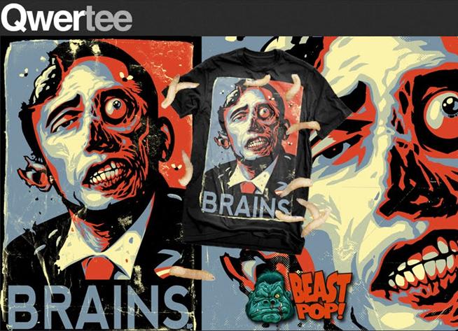
ZN update 1: as shown here, the ZOMBAMA shirt is in fact on sale NOW for a limited time in the
UK via Qwertee.com!!!

ZN update 2: in addition, the design ‘Glass Bast’rd’ shown at the end of this blog
will be offered via TeeFury.com under the name ‘Not Kool’ starting December 21st!! Just in time for December 22nd everywhere!

On the other hand, is there any sense for you of 'oh no, I don’t want to be known as the ‘ZOMBAMA’ guy the rest of my life'? How does an artist eventually balance the two extremes, namely, a sudden and significant success with the potential ‘pigeon-holing’ that might naturally follow it? Like, do people phone you up and say ‘oh please please do me in Zombie form?’ (just thinking maybe Sarah Palin had called).
I have only had a couple requests so far for a Zombamafication-type design, but one was from a really distasteful ‘band’ that I simply did not want to be associated with, and the other guy just simply couldn’t afford me, I think.

In all honesty, I don’t mind being pigeon-holed for now. It’s the piece that started me on the road to recognition, so it deserves to be one of those things I’m most associated with right now. Most importantly, I definitely think I am growing and moving above and beyond that! I am convinced that there will be much more that I create that will cause people to take notice. So I don’t think I’m forever going to be known as ‘the Zombama guy’.

I would note though for our readers that more recently, your ‘historical Japanese’ take on PAC-MAN (shown above) has also experienced a good level of sales (true story: I had been looking at this pic for a while before I realized what the pattern on his skirt was... I’m still sore from the headslap). This raises another interesting aspect of the work of modern ‘pop art’: how important is it for an artist to really do his homework and research a piece before getting started?

In addition, and here I want to play devil’s advocate a bit: how do you eventually draw a line between ‘basing’ a piece on something you find and avoiding the very processes which have seen your own works ripped off?
With the Pac-Man samurai design, avoiding rip-off territory was easy:
the back-story I included in my blog post about the old scroll print and the ‘real’ inspiration behind the creation of the game was all baloney! I made it all up!

Now, don’t get me wrong: I still did my research, and I always do, even if it’s just to make sure I’m not accidentally ripping something else off or ripping it off in just the right way (there’s a very fine line). For example, with my recent
Boba Fett/Speed Racer piece, I wanted to do a fun mash-up of Boba with some other lesser-known (to me) pop-culture icon. When I stumbled over the Speed Racer imagery it just seemed to fit, plus it allowed for some minor commentary on Lucas and his Star Wars empire.

I immediately scoured the Internet to see if anybody else had run with the idea before me, and this is usually what I do before sketching even begins. I’ve had many a ‘brilliant’ idea that it turns out were already conceived and executed by other artists.

You’ve also mentioned being selected to appear in various collections (e.g. the
SPECTRUM annual art book) but having just missed out on others, as with the Darkstalkers Tribute shown here. What does that mean to you both personally and also professionally when you get invited to be involved in something like this?
Well I wasn’t ‘invited’ to either, unless you count open submissions as an invitation. The SPECTRUM thing was a nice surprise and an honour to be included in. Things like the DARKSTALKERS TRIBUTE are disappointing, not only because my design didn’t get featured, but because I’m not too keen on that sort of ‘contest’ in the end. It’s just that you pour all this time and effort and passion into a piece, hoping to be published in the book.

But in reality, the publishers of things like that are essentially getting a lot of free work which they can make money off of by selling the book, and there are no payments or prizes to published artists outside of a free copy of the book. I’m probably going to stay away from such things in the future, but I will be submitting to SPECTRUM again this year.

My son and I have enjoyed looking through your character designs for ‘
COLLIDE-O-SCOPE’ trying to imagine what neat stories must go along with the gang. How did the concept pitch go?
COLLIDE-O-SCOPE was actually my senior thesis at Ringling School of Art and Design. I came up with a pitch for an animated series (or maybe comic book) based around a crazy, mega-popular rock band. This included a ‘series bible’, full character descriptions and finished concept art for all the major characters. It was tremendously fun to work on, but also tremendously stressful as it involved many sleepless deadline nights.

I have yet to really do anything with the pitch outside of simply posting it on my old blog, but I have every intention of dusting it off and doing something with it soon. I hope.

Can you share with us one thing that no one or let’s say not many people know about you that will not get you arrested or otherwise in trouble?
I collect spores, molds and fungus. No, really..

Other than that, I do seem to have a predilection for ‘starving artist’ type pursuits. I think that if I had not chosen to be an illustrator or had no artistic talent, I would have traveled the path of the musician instead. I love music and I loved creating music back when I had time to. I love singing, playing bass, guitar - I just simply don’t have the time to pursue both, so the world gets BeastPop ArtWorks instead of BeastPop MusicWorks.

What else would you like to add as we begin to wind things down?
I think I’ve been long-winded enough, so I’ll just say if you like my work, follow me on Facebook and at my blog (and maybe Twitter, if you’re nasty) and spread the word.

And, hey, if there’s any wealthy philanthropists out there looking to give a hand to a starving artist whose entire computer set-up is dangerously close to crapping out on him, I’d make a perfect candidate for a large grant of some kind. I promise to use the money wisely and put it towards fancy equipment that will boost my production speed... and maybe as well a screen printing set-up so I can print my own shirts and posters. I will also swear loyalty to you should you become the duke of your own uh... dukedom after the zombie apocalypse AND I’ll name my next pet after you.

Plus, if there’s any lawyers out there, I might soon be needing the pro-bono services of someone who is equipped to handle George Lucas’ attack dogs! BeastPop out!

ziggynixonziggynixonziggynixon

Jared Moraitis and BeastPop ArtWorks are currently to be found in the foothills of the glorious and extremely visit-worthy Blue Ridge Mountain area in Hickory, North Carolina (yes, I have family from this region who would benefit from increased tourism, why do you ask?). He’s got oodles and oodles of honest-to-goodness talent and we are really looking forward to seeing how his next projects come out!!

Keep checking back at his blog and/or social media sites often, as he likes to keep his viewership and fans posted on how given projects or pieces are advancing!! Plus, it’s a great way to keep abreast (oops, sorry Facebook!!) of the tee-shirts or other design voting’s going on! In addition (or ‘Plus, The Return’), he occasionally re-posts some real-life ads for freelance illustration which are totally stupid but funny as ... well, they’re really funny, let’s leave it at that (for the kids, you know).

To help you with your own enjoying and finding actions, again you can find the following stuff at the, uh, following links:

Illustration Blog:
http://www.beastpop.blogspot.com

ziggynixonziggynixonziggynixon

All pictures, videos and other media are used with written permission of Jared Moraitis, including all current or previous business affiliations related to same, or are available in the public domain (noting copyright and other restrictions, accordingly). No further reproduction or duplication is permitted without contacting the artist directly.

Some pictures have been modified slightly or combined only for the purpose of space limitations.