Showing posts with label photography. Show all posts

January 26, 2009

Energy to Spare and Nothing to Hide

An Interview with Photographer Pablo Wünsch Blanco by Ziggy Nixon

When I recently sent out a “call for talent”, I was very pleased that good pal
Martin Oeggerli turned me onto the work of Pablo Wünsch Blanco, a talented, young photographer situated in Basel, Switzerland. Not only was I blown away by Pablo’s unique vision – from his work with pin up model Zoë Scarlett and other, perhaps not so well-known faces (yet) – but I was also very surprised when I realized how much of Pablo’s work I’d already seen. If you have been in the area any time in the past few years, you’ve no doubt enjoyed his recent Saturday morning photo column in the Basler Zeitung; his work for Basler Kantonalbank or Pirelli, among many other well-known local or larger businesses; his various many campaign posters for local political figures; and for sure you’d have seen one of his celebrity portraits on the cover of a certain regionally published magazine that even he might not let you know he’s done (sorry, I’m sworn to secrecy).

Before starting, I will say this interview was indeed very educational and a whole lot of fun – albeit an exhausting couple of hours – because Senõr Wünsch definitely runs on high octane fuel. It was also incredibly interesting to hear how this energetic fellow manages to not only create and tell a story when photographing gorgeous models or other specific scenes, but also makes the dourest bank worker come off looking terrific and even a tad playful.


Pablo, what would you say is the difference between your work as a photographer and the service we get in the village photo shop where we buy our cameras, have our film developed, etc.?
I think basically the difference is that I come from a different background than most professional photographers. I’m not a trained photographer; well, I did take an elective course on photography while I was working on my design major during Art School. And, truth is, my father had a black and white photo lab at home and I did spend lots of his money on film for years. So, okay, I guess I had a bit of an advantage. (Laughs) But after that, I didn’t even pick up or own a camera for like 10 years.


I find it very funny that you ask this question. The kind of neighborhood store like you mention is for me something like a “ye olde photo-shoppe”; it’s a place where you go to make very cheesy photos of yourself. Don’t get me wrong: it’s perfectly fine because we all need cheesy photos sooner or later, you know? Maybe it’s family portraits for Grandma or wedding photos or whatever. I mean, there will always be a necessity for these types of photos.

But clearly there’s another market for photographs that are created following the design process. Simply put, if a client needs an image to illustrate a text or help sell a product or a concept then you have to create a photo that responds to this problem, you have to answer to a necessity. My customers call me and say, “We’ve got a new product coming out. Can you help us create an image that helps to sell the product, maybe even specifically to promote it in Market X or to Customers of Type Y?” Or they’ll ask: “Can you photograph my employees in such a way so that when our clients look at the photos, they associate my team with the spirit of the company?”

So we then sit down together and work through a real design scenario. We identify what’s the target, what they want to say or achieve with the photo in order to form and propose an appropriate image. Therefore, for me, my work is very much creating photos for a purpose. Simply put: I’m just finding an answer to a problem. These are the images that I strive to make.

Don’t get me wrong: if you want a photograph for your Grandmother, I can do this, sure. And she will be more than happy with it! The goal in this case is not that you look good per se; it’s that your Grandmother will be happy with the photograph.

Is photography just a means of putting your art out there in a way people can see it?
I do have a big problem with the word art, to me it sounds really big. I think of art has having more to do with an uncontrollable desire to create and find new ways to say things, kind of like what scientists do. For me art doesn’t have as much to do with creating well-composed, correctly illuminated photos which at the same time allow me to make a living.

I am mainly just a commercial photographer; my job is to make photos that work. Often I feel more like a technical artisan. I don’t know, I think of myself as being more like a dentist than an artist sometimes. You know, making functional and attractive work with expensive tools. (Laughter)

That I am trained formally at art, that I’ve taught art, and that I sometimes do practice forms of artistic crafts, okay, yes. And a lot of people do make art with cameras. But do I create art with cameras? I don’t know. Time will tell. What is art anyway?

Having been an art teacher, ski coach, designer, musician, and more, how did you wind up in photography?
Well, I used to work for a few years as a designer for a merchandising company here in Switzerland. I ended up doing basically everything that involved visual communication, including lots of photo re-touching, graphic design, some product design, photography of both products and people, web-pages, you name it. And of course all of this had to be done very fast and always with at a very high level of quality. However, after a while, I felt that I was somehow doing too many different things and instead needed to specialize in one area in order to really grow.

Then, at one point, we ended up having to arrange a beauty shoot for a display for a very well-known cosmetic product. The pressure was really high because we had to get it right in order to keep a big account. And as fate would have it, the boss proposed that I take it on. I really had no clue about what I should do or how to do it. But the challenge was for me, I don’t know, I guess too sexy to let pass. So, with a 3 megapixel camera, one of the company’s secretaries, lots of ingenuity and even more photo-shopping, I somehow managed to get a quite acceptable result. And along the way, I found that I enjoyed the challenge very much and I quickly realized that I could get paid for doing more of that.

You’re an actor as well, correct?
I don’t think I’m really an actor. I’ve just been in a couple of amateur plays in the last years. In fact, I just finished playing a Mexican drunk named Pablo in an English speaking production of Tennessee William’s “A Streetcar Named Desire”… so I didn’t even have to act (laughter). It is something I enjoy doing. Actors are a great bunch and I learn a lot that even helps me with my work as a photographer. But me, an actor? No…

When you take a picture of a person, are you necessarily trying to tell a story about them or involving them, or does it just sort of happen after the fact?
When I am shooting portraits for magazines or doing private sessions, I really try to find and show something more about my subjects. I want to find what they have inside and for me that is the way to create a story. For example, I recently had a young lady walk into the studio and she was gorgeous, I mean, really beautiful in every way. When she walked in I said “sorry, you’re so good looking it’s really going to be boring to photograph you.” I mean, I hate the way women are often just photographed from a very macho point of view, you know, as disposable sexual objects, so distant from the spectator. I try to avoid that, unless it’s the specific point of an assignment.

So in this case we agreed to try and create a photo that showed another part of her. We worked for a couple of hours until she looked different, I mean, in a way she was never photographed before. We tried to create something that was really going to be an exciting and challenging photo to the viewer. And even today, a lot of people stop and tell me that this photo of her is a little messed up. But that’s the idea: to sometimes create something that’s shocking and different. Maybe a photo like this does fall more into the artistic category.

I am really curious then about your thought process in making the photos of this young lady:
Yes, this is a great example of how I like to approach photography. In this case, she came in here and said “I’m a handball player, I’m very fit and I’d like to show it, but without looking too masculine.” I had the same thought and I knew if I wasn’t careful the spectator would get the wrong idea. I mean, she was not only in great shape (ZN: just look at those, uh, muscles) but she had short hair and really strong facial features as well. But she IS extremely attractive and quite feminine, too.

So we looked for a way to combine these elements and decided to try a different approach. This was really interesting for me because you don’t see many photos that try to combine such a strong masculine side with a very soft, very feminine side unless it’s just for very high-end fashion photography. Maybe it’s very stereotypical but I love to play with this sense of androgyny, which for me has to do more with the perception of gender as with sexuality per se.

I enjoy how you’ve lined up your pictures on your web-site, combining both a balance of innocence and beauty, with a bit of subtle eroticism thrown in. Can you give some insight into how you approach your on-line illustrations?
I think it’s funny that you see that and it makes me happy, because that’s a very big goal of mine to create situations that are very intimate. How do I achieve such different effects? (Long thoughtful pause)... Brainwashing (laughs)…

Take for example the stereotypical “okay now: make love to the camera!” It’s a great line, but in my experience it only works in the movies. For me it’s all psychology, maybe even a kind of mental manipulation. I do have to manipulate the people in a positive way and make them very comfortable.

And you see pretty fast when you begin working with someone whether or not they’ll open up quickly, because everyone has a different level of willingness. Some people can get to an intimate point rather easily but others are totally blocked and you have to try a different strategy – even with humor or who knows what. But you can’t create this kind of moment with everyone in exactly the same way.

If I manage to bring the person to a point of connection that is very intimate without being sexual per se, then I’ve accomplished my goal. It can be disturbing for a lot of people to see the photos later, some even tell me they find my images very erotic; but it’s great that we can achieve this level of connection for these 2 minutes or so. It is very intense for the person being photographed. I mean, they don’t know me but within one hour or so I have to bring them to the point that is needed to achieve such an effect.

I guess I’m pretty good at reading people and can bring them in to a level of self-confidence where they trust me enough to do things they would never do with any other stranger. They put themselves in situations that are different, even risky, on the limit. I put 110% of myself into the shooting, so I suppose I just drive them on with me.

Then, if I’m fast enough, I can capture just the right moment and maybe show a little window into the soul of the person. Perhaps the person is not usually like this or will never act like this again; but for that one moment that hidden part of them that is somewhere inside of them will show itself. Then the image is truly unique.

I think it goes back to the question about why I decided to get into photography: I guess for me it’s this great mix of psychology, art and technology. It somehow suits my personality pretty well. And for the pictures on my web-site, I love to mix these up and show just the range I can accomplish this way.

Is there a secret for you how to keep a photo erotic vs. pornographic?
I guess you have to create something that has a strong hint of sexuality without showing anything pornographic – like showing a lot of skin or genitalia or whatever – but this is still very challenging. But if you’re successful, it’s a great achievement. I think the strongest aphrodisiac is the brain and what it can convince us of in terms of what we may NOT be seeing. Kind of like a really good horror movie where you actually never see the monster, but you know he’s there just lurking in the shadows.

The pictures in this series seem to combine a trace of innocence and mystery, yet also a sense of real animal magnetism and even lust. How do you approach such photos?
(Laughs) I don’t think anyone has analyzed my photos as much of you. Don’t get me wrong I like it a lot, it’s fun.

Yes, this lady is an actress and she had called me to do some photos for her “book". She was going I believe to a Hungarian ball or something like that and just wanted to take advantage of her outfit and getting all fixed up. So we just improvised a little session to see what we come up with.

It was a very peaceful, beautiful evening – plus, we had the luck that it was snowing outside – and she was just so gorgeous in her costume and make-up and all. And I really wanted to tell a unique story: to me it was all just so glamorous, it looked somehow to me like some kind of champagne commercial. So I thought about how would I present the feeling that you get when you have two glasses of champagne and maybe go outside for a romantic walk in a beautiful villa. You know, I wanted the photo to be mysterious, a little blurry, a little like you know how when you do things with a trace of alcohol in your brain but everything still feels so great.

How do corporate portraits fit into your vision?
These photos are in fact much more difficult to make because you don’t have any space to move, both literally and figuratively. For example, I recently completed a dozen portrait photos for a private investment bank, with very concrete artistic direction already being decided on and given to me from an advertisement agency. I mean, I had very exact guidelines that I had to work with in order to show the spirit of the company via their employees: frontal portraits, illumination defined, all portraits had to be very similar, emotion serious, communication in the eyes and with only a little hint of a smile.

Now, imagine in addition to all this having to work with a person who’s just had make-up applied and their hair fixed up – perhaps even, if you will, against his or her free will – and afterwards they have to jump in front of the camera and pose for a tall, fast-talking Spaniard who they’ve never met. But even under these circumstances and in only about 15 minutes, I still want to get into their soul and show that special “something”.

It really is hard work. Most of us do not really know what to do in front of a camera. I mean, if these people would be professional models, they would not have any problem with direction. If you wanted them to get naked, clothes would fly; if you told them to jump, the answer would be “how high?” I mean, this is what models are paid to do, aren’t they? Someone recently described it to me saying “models are more than happy to be paid to be the canvas; they really do not care much how they look on the photos”. But for most of us average Joe’s or Jane’s, it is hard to let go, to allow someone else to decide how we should look or pose.

I also enjoy this kind of work so much because when I look at it later, I love to see that I’ve managed to show everyone in a way that you can tell they’re all on the same wavelength, that they’re all representing the same ideals of their company. I mean, everyone is so different to start with. It’s like music: maybe you want to record a group of people singing the same note but you have to record them all separately. But how do you bring all these persons to hit exactly the same note? Now add to that the challenge of having to make a song out of these notes and the task becomes even more difficult.

Still, working with these managerial types is really great. Okay, they portray themselves as serious professionals; but many have the same feelings and fears as any of us do when we’re in front of a camera. I mean, we’re all afraid that a double chin or a mole will show up. They all want to know if you’ll photo-shop out their little defects, etc. I just find it very fun to work with them.

Is this similar to your work for magazines that often require some kind of “stock” images to support their articles?
Just as with the portraits we just talked about, this kind of photography is actually a very satisfying part of my work, again in many ways because it is very restrictive. These are photos that are actually very complicated to create because everything has to perfect and people already have a very clear image how these images are supposed to look like.

Okay, afterwards the images may look to be very simple and straightforward because we see so many just like them. But at the same time, if they don’t have this consistency with the expected vision, they do not work – well, most of all, the customer won’t be very happy with them. I mean, the photos that I did as well for
Impuls Magazin about a “Sunny and Healthy Summertime” HAVE to look like many others you’ve seen, that’s the goal! They all HAVE to look like they were made at the beach, on a warm and sunny day, you know, very American, very Californian.

Many criticize me terribly for this kind of work and ask, “how can you do something so cheesy and lame and typical?” So even this type of photography is a bit controversial as well. But honestly, what would be accepted otherwise? I know I wouldn’t buy a cereal with an ugly kid with crooked teeth and bad skin shown on the package. Would you? I mean, we consume this kind of imagery all the time. And someone has to make it.

But also, once in a while, I do get some “fan-mail”, as was even the case with these images. I had someone write and tell me that they had never seen the love between mother and daughter so well represented in a photo. I guess I will never be able to keep everyone happy.

Take this photo of this woman at beach: Like Ansel Adams, did you have to wait hours and hours for the perfect setting?
No, I know what you mean, but this just proves that I’m the luckiest photographer in the world. Seriously, in this case, we had a 2 hour window in the biggest rain storm they had ever seen in Mallorca. Then, boom, we caught it just right.

Okay, to be honest, wherever I’m shooting I do spend some time studying the surroundings and the setting in great detail. I do research on the weather, I study how the clouds work and I try to set up a plan to make my vision of the shot work. Still, I was glad this one came out so great.

In terms of getting personally involved in your work, how do you react when a photo is rejected?
Oh, it totally breaks my heart.

No, no, it’s nowhere near that bad. Of course, the photos I present to a client are in my mind always great ideas; in many ways they’re like my babies. But maybe the client just thinks the opposite, even though I know that I put a lot of effort into it, just like I do with any job.

It’s just that a photo also represents my pride in my own work. So sure it hurts a bit. But I realize that if it doesn’t work, if it’s the wrong approach to the problem the client has brought to me, then it’s not a knock against me personally or my skill as a photographer per se.

In terms of the emotions in general for my job, I think the only problem I have comes when maybe for economic reasons I’ll take a job where I’m not 100% convinced or enthusiastic about the project. It has taken me a very long time to learn to reject jobs that do not interest me. Maybe that sounds arrogant, but I think it’s much more honest towards my clients if I just tell them that up front. It’s just that from the smallest to the biggest projects, I will not be happy if I don’t give my full effort.

What’s it like balancing photos that might be considered truly freelance and the more corporate side of your work?
Very rarely you will see me with a camera in the hand unless I have a contract to shoot something. Not even when I’m on vacation. And then, most of the time I do not have the courage to show these photos, my private work, to anyone.

Actually, it was only a couple weeks ago that I for the first time EVER put one of my photos into a frame. That is probably why I keep saying I am not an artist. But on the other hand, I do not see myself as a business man either. I still have a hard time walking into someone’s office to try and explain how good or how cool my work is.

I guess the problem is to find that magic point where I find myself doing something that is creative and challenging and still actually managing to get paid for it. I suppose it’s more of a philosophical question, more of a life-style choice.

Our mutual colleague, Martin Oeggerli – known by the millions of his adoring fans as the talent behind the
Micronaut site – has had recently some commercial success selling his works as high quality prints or even as posters. Are you interested as well in selling any of your pictures like this and perhaps spread your work out a bit into the market?
Up to now, seeing my photos on a magazine cover that has a circulation of 400’000 or on a political campaign poster hung up all around town or throughout the country, well, to me I think that’s even cooler than being in an art gallery. Anyway, how many gallery shows do you go to? Honestly?

But I do get asked that question a lot … and believe it or not, I’ve finally managed to convince myself to put some prints for sale via my home-page. In terms of this, I am very excited at the moment about producing some affordable limited edition prints. I’m making sure also that the prints are specifically created to fit both visually and in terms of size into an IKEA or other really affordable type of picture frame. So after you order my pictures on-line, all you have to do is just get the correct frame and voila: for a little money you get a signed original that looks terrific to hang on your wall. I guess the designer in me isn’t ready to give up just yet on the whole fame and fortune thing (laughs).

And about Martin, as you know, his work is really unique. But I admire his drive the most. He has worked extremely hard and loves what he does. People think that I run on jet fuel or whatever, but I honestly think that this guy is worse than me. I actually doubt he even sleeps and I really do not think that people realize how much work his images require! I mean, here’s a guy that has created not only an amazing concept but invests thousands of hours of detailed work to make it happen!

Why is your web-site called Auslandia?
I definitely feel like an “Ausländer” – foreigner in German – anywhere I go. For example, after 15 years abroad, I feel like a foreigner when I’m in Spain. Even when I was a kid I always had the darkest skin since I’m half-Mexican and half-Spanish, so the other kids called me funny names. And even while I was working in the United State I was considered a Latino. I didn’t even know what that meant. I wondered if Latino meant that I was supposed to come from Latin America? Or did they mean Latino like being from a Latin culture, like either the Italians or the French?

Obviously, I’m not really Caucasian, but check out my last name and how tall I am (ZN: about 6’4” or so). And then I came here to Switzerland in 1998 and I was labeled a “Südländer” (lit. “south lander” or southerner). And you know how difficult is to integrate in this area, so I will always be a foreigner here as well. Or maybe you’d consider me an ex-pat. That may sound cooler but I don’t feel like that either. I mean, I work here, I live here, I pay my taxes here, this is where my life is; but I’ll always still be a foreigner.

Another reason the web-site has this name is that for the longest time I couldn’t pronounce my last name “Wünsch” in German (ZN: smoke ten cigarettes then try to say ‘Vooensch’ and you might get close) so I wanted of course to create a name that people could remember. I think my design-oriented brain put it together to run like this: when people ask me about my work I say “just check out Auslandia.com.” Then they always say, “What?” and I just say (in German), “you know, like Ausländer. I’m an Ausländer, so just think Auslandia. Sounds also like Australia, okay?” And then they can remember, so it seems to work!

Even after researching your work and now having talked to you for a couple of hours, I still finding it difficult to define your work in terms of your style.
That is a critique that I hear sometimes, that I don’t specialize in any one type of photography, like only nature photos, or only nudes, or whatever like other photographers do. I just think it’s reflective of the fact that I’m very multi-faceted in my life. That is the way I am. I do music, I do theatre, I’m a sport freak, I do photography, I do many things. And I do them all at the same time at the highest level I can.

Recently, a very well respected photo editor told me that the problem she had with my work is that I don’t have A style. She told me that if she needed someone who could do ANY job very well, she’d call me. She probably meant it as criticism, and probably in the artsy cosmopolitan scene, it would be interpreted as a very sharp rebuke of my work; but for me, it was actually a great compliment.

I mean, if you compare this to a musician, wouldn’t this be the best compliment you could ever receive? That I could play several instruments and many styles really, really well? I look at it like as if you had the chance to be, I don’t know, B.B. King vs. someone that can play everything. Don’t get me wrong: I do love B.B.’s music but in my case, I wouldn’t be able to play the same songs in the same style all my life. I’d much rather be someone that could play a lot of instruments quite well and could get paid good money to perform in all different kinds of settings. Sure, I’d love to play the blues very well, but I’d also love to go to Austria and play the cello in a concert hall one night or go out the next day and play drums with Mötörhead in an open air festival with 200’000 fans screaming my name.

Is there a particular type of client you like working with the most?
Yes, rich ones. (heavy laughter) No, seriously ...the bottom-line for me is that I want to have fun. I don’t care what or whoever I’m photographing. Even if it were the Queen of England, I’d still be cracking jokes and trying to make her give me a little smile.

I love it when the feedback I get is not only that the people I work with like the photos but most importantly is that they had a great time making them with me.

ZN ZN ZN ZN ZN ZN ZN ZN ZN ZN ZN ZN ZN ZN ZN ZN ZN ZN ZN ZN

If you want the quick & dirty version of Pablo’s biography, well, good luck … or perhaps better said, we’d need to start another blog just for that. Born in 1970 in the northern Spanish city of Santander, he later studied Fine Arts, and has over the years worked as art teacher, ski coach and as a designer before finally reorienting his career towards photography. Despite evidence to the contrary as pictured here, he is not nor has ever been a professional gigolo.

Pablo is also reported to have been an enthusiastic alpine ski racer in his youth, and he is still an avid cyclist. Apparently, he prefers beer over wine and daydreams about owning a yellow motorcycle and a Catalonian Sheppard (we think that’s a type of dog), though it’s not clear if all of this is intended to be enjoyed simultaneously. Other interesting facts include that he volunteered at the 1992 Barcelona Olympics, he’s had surgery on both his knees, and that he’s even played guitar in a glam-punk band, albeit perhaps not as well as he would have liked (but they did make it onto the radio a couple of times). And a couple of random facts: (a) he often refers to himself as a "Ninja" though he has in fact NEVER practised any form of combat sports (instead it's because he moves fast and likes to wear black, go figure) and (b) he seems to have enjoyed the interview process quite a lot because if for nothing else, he was finally able to describe to his sister what he does for a living.

If you ask him about his final stop in terms of careers, he will tell you that this may be the one. Why? Because he feels comfortable doing it, he’s good at it, and perhaps as well that it doesn’t involve any serious heavy lifting. All kidding aside, he has an
impressive listing of local and more distant clients including Ayuntamiento Barcelona, Basler Kantonalbank, Basler Zeitung, Banque CIC (Suisse), Bank Coop, Boots Healthcare, Burger King, Eurocom Visual, Erdgas, Eezytool, Fossil, FDP, Helvetia Patria, Krebsliga beider Basel, Museo Cristobal Balenciaga, Pirelli, Regio Aktuell, Strassenmagazin Surprise, Syngenta, Swisslite, Triodos Bank NW Spain, Verband Schweizer Kantonalbanken, Young Stage Circus Festival, and many more.

For more on Pablo’s works or other comments, ZN proposes these web-links:
- Home web-site at
www.auslandia.com including:
>> Access to lots and lots of examples from portfolio at
http://www.auslandia.com/a/portfolio/thumbs.html
>> and also a great collection of more “corporate” and other printed offerings at
http://www.auslandia.com/a/archive/index.html
>> Pablo's blog which he uses primarily to keep his family and friends up-to-date on his shenanigans
http://auslandia.wordpress.com/
- We also recommend checking out Zoë Scarlett’s
interview on TeleBasel (in German, well, Swiss German to be exact), from 28. March, 2008 where she said more or less, “… there is only one photographer, his name is Pablo Wünsch Blanco …”, a quote that we suppose she is still trying to live down…


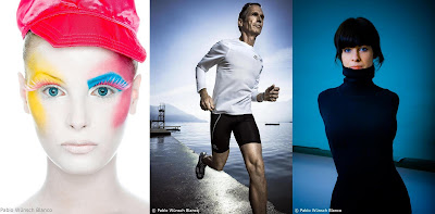
As a final treat, here are some of Pablo's most recent images:


ZN ZN ZN ZN ZN ZN ZN ZN ZN ZN ZN ZN ZN ZN ZN ZN ZN ZN ZN ZN ZN ZN ZN


All photos and images used in this article are the sole property of Pablo Wünsch Blanco and are used with his express written consent. Whereas Pablo thinks it's ultimately a compliment if you want to copy and use his images for a presentation or something, if he catches you using them for something like an album cover without his permission, he'll have his assistants Ziggy Kneecapcracker and Knuckles MacGillicutty come to your house and redecorate. No seriously, hire this guy, he's really good, we only wish we could have shown more!

July 26, 2008

Designs Unseen – "Micronaut" Martin Oeggerli

This is the full version of an article printed first via www.xymara.com at this link.

All pictures and images full copyright of Martin Oeggerli, used by special licensed permission.

Very rarely when doing research about a given artist or designer are you going to come across statements next to their names along the lines of "E2F3 is the main target gene of the 6p22 amplicon with high specificity for human bladder cancer." But this is in fact indeed part of "micronaut" Martin Oeggerli's world. Splitting his time between his "day job" doing extremely valuable cancer research at the University of Basel's Pathology department and his passion for photographing the "micro-cosmos" around us, Martin is living his dreams.

Using a technique involving the utilization of extremely delicate and highly sophisticated scanning electron microscopes (SEM) to just even begin his process, he has developed over the past years an amazing portfolio of the "seen and unseen" in our world. And to meet Martin is to experience firsthand just how passionate he truly is about his work. Whether its excitedly describing the differences in the quality of hairs of "cute" jumping spiders or contemplating the small and somewhat mysterious objects hiding between a butterfly's scaly winglets, Martin not only brings his work to life through the images he creates but makes you really look at the world around you in a new light.

I was fortunate enough to catch up with Martin prior to the opening of an important new show of his work:

Martin, please explain how you got interested in photography and design?

For as long as I can remember, I've been interested in beautiful images. Also, when I was younger I did a lot of drawing, illustrating very detailed and accurate pictures of different things.

My current style of work started when my father gave me my first camera in 2004. I think I made 20'000 pictures in the first few months alone because I had just such a great time with it. The camera was very functional and allowed me to focus on all sizes of views. You could also rotate the zoom lens pretty easily and get really comfortably close to just about anything.

A few months later, I was asked to do display some of my work at the Institute of Pathology, University Hospital, Basel because at that time and until very recently we had always artist exhibitions several times per year. You see, we have a full-time photographer at the Institute and he really liked my portfolio. So he encouraged me to display my work, which was terrific because usually the show was reserved for "real" artists from all over Europe. This was not only surprising but actually very successful for me and got me my first "exposure".

I "switched" to the Scanning Electron Microscope or SEM (REM in German) in 2005 (I of course still enjoy normal photography). This started literally the day after I finished my thesis. You see there was a company here in the area that really needed some technical support. They wanted several large color SEM pictures, but of course SEM only provides black and white pictures.

Still, they knew I had a science background and was also interested in photography, so they thought maybe I could support them in generating some nice colored SEM pictures. So the minute I successfully closed out my PhD studies in molecular biology, I started both with them and also with my post-doc here in Basel.

Had you worked with SEM techniques before that?

Only once during my diploma work. My research was about bats and specifically their hair structures. So that was my first experience with SEM imaging.

When we started the project though, several pictures had to be finished quickly because they had an important project to complete. So it was very much "learning by doing". But despite the urgency, I found I liked it so much that I found myself really addicted to this method.

So I kept making more pictures and really tried to improve my work. I also definitely have to add that it would have not been possible for the support that the University of Basel (ZMB) gave me at that time, for which I'm still very grateful.

As you indicated, SEM generates only "black and white" pictures, obviously with many shades of grey. How do you ultimately then convert these to make colored pictures?

When I was asked to do color SEM's, my initial task was to explain that all we would get from the instrument were black and white pictures. I had to make it clear that any coloration would have to literally be made by hand.

In these first cases, we were under such tremendous time pressure that I didn't have the opportunity to learn coloration methods like a typical graphic designer might use. I just had to basically jump in and rush the project through, but it did allow me to develop a very unique method that I was glad worked quite well.

I've seen you don't like to give out details to your exact method.

That's right, I like to keep this my "little secret." Really though, anyone could do this I think. But it is of course an advantage to be familiar with biology and also it does take an incredible amount of patience. I think that's where my design talent is really helped a lot, in that I am a very patient person. Also I'm really quite a perfectionist, so having patience is a must.

I've heard that one design can take up to 100 hours to complete?

Yes, sometimes when I combine several scans that have views of different "areas" of a subject, that is to make a larger "landscape" view, the coloration can be an incredibly detailed task. Basically, the more details I want to illustrate, the longer the process takes.

But I try to find time wherever I can to work a little, even on the tram on the way to work or the train ride down a little south of here on my way to the SEM lab.

Your father is also interested in photography. Why did he wait so long to give you a camera?

Well, my father does enjoy photography and although he's very good, he only considers it his hobby. In terms of giving me – and my sister – a good camera, I think he really wanted to wait until the digital technology reached a point where I could really benefit from it.

It worked out really well though because with digital you have such freedom and you can learn very quickly by trial-and-error. I was able to not only experiment a lot and try different things in a relatively short amount of time but at much lower costs than with "traditional" film-based photography.


You say its beneficial for your design that you are "well-versed" in a number of scientific areas. I want to list these for our audience, because I understand this includes studies in marine biology, zoology, botany, anthropology, paleontology, as well as behavioral and evolutionary biology, all of which has lead eventually to your role as "investigator" of molecular and cell biology.

Okay, with this amazing resume in mind, is the reverse true, namely, does being a "micronaut" help your work at the University?

Oh yes. At the moment, for example, I'm working on a project looking at prostrate cancer and particularly in those cases where it returns even after initially successful treatments. We have found a gene that is highly amplified in recurrent cancers. This gene seems to play an important role in prostate cancer progression. Of course we want to learn more about its function and hopefully finally use it as a target and "knock it out", that is, develop a successful therapy and ultimately help pave the way to a cure.

As fate would have it, one of the effects we do see after artificial "deactivation" of this gene is that the cell shape changes depending on the success of a treatment.

As such, it's possible to use the same technique as my design work to explore and document this effect as the research team's work progresses.

Can you describe a bit about your actual design process?

So much comes from the coloration, which in my eyes is really the beginning of designing an image. If I were to show you the original black and white scans vs. the colored versions of a given photo, it would evoke a very different reaction and have a completely different effect for you. It's a totally different world.

I think this is because humans see everything around them in full color. So the images only first come to life with the color. And it can change so much with the color in terms of what we see and the emotions we feel. The entire impression of the image may change considerably with even subtle color variation, even if the light is "coming" from the left or the right can be extremely important (I have to ultimately imitate the effects of lighting). Again, I'm a perfectionist, so I really try to do my best to truly represent what the image is portraying.

Preparation is also very important, because it represents the basis of every final image. Especially in the case of smaller the objects, for example, if you look at different bacteria living in our stomachs or even much more sensitive life forms (e.g. fresh water bacteria), they are so very fragile and can be destroyed only by the slightest differences or defects in the preparation process. As such, sometimes a lot of trial and error is needed to finally get suitable high-quality SEM-scans for the coloration process.

One of the main reasons you have to be so extremely careful is because SEM requires that the sample contains no water, otherwise it would create a bad image and maybe damage the very expensive equipment as well.

Is the preparation part of the art for you?

The preparation is a very challenging part from the technical viewpoint and is certainly of fundamental importance in the overall process from a scientific point of view.

However, art has a lot to do with freedom and my freedom begins once I have managed to produce a technically flawless image from a well-preserved and hopefully interesting sample.

What criteria do you use to pick your different subjects to photograph?

At the beginning, I just found so many things interesting, both from my work, as well as things I would literally find in my own back yard.

For me, the effect is like flying through a range of microscopic mountains in a helicopter, or even scuba diving through mysterious deep-sea valleys teeming with unknown life. There's just so much of this "landscape" that I want to explore.

But of course you get a lot of bad samples, too. For example, the leaf of a salad is 98% water and it has to be dried and prepared accordingly, that is, trying to keep the cells in their original form. Again, the SEM "camera" is such an expensive piece of equipment that it requires great care.

But still, the coloration is so very important to achieving the best designs, so I really take the time to ensure I have the best possible sample. Too often, you have even "technical artifacts" that – without going into too much detail – can even cause very "bright" areas to appear. This can even destroy the sample, which occurs when the SEM beam doesn't detect the right "balance" of returning electrons.

The bottom-line is that it just takes patience, patience, and more patience.

What do you experience when looking at something for the first time on a microscopic level vs. a macroscopic level?

Sometimes of course you detect things that were not at all expected. This is such a thrill.

In the beginning of my work, this was the case all the time – well at least it was when everything lined up, namely that I had good samples and the technique worked well. But there were a lot of disappointments, too, and it was very time consuming in terms of number of hours spent working compared to the number of useable pictures I was generating.

What did you learn from your first illustrations or even some of those first mistrials?

Now I conduct in fact quite a lot of research on my "subject" before I start the design process. I try to have a plan in mind what kind of unique aspects I'm looking for that will ultimately create the most beautiful image.

Even then of course you can still get many surprises and get something very beautiful. I often find that the available literature and research about a given subject – be it pollen grains, or butterfly wings or whatever – will not even be fully able to explain some of the things I see and illustrate.

How much of this work comes from carefully aiming your "camera" at a given target vs. let's say, chancing upon an interesting view?

Of course chance plays a big role. For example, "finding" the picture shown above with the one piece of willow pollen "peaking out" from the flower was just a fantastic experience. This view illustrates not only important scientific aspects but really seems to jump out of the picture, almost like something being born saying to us, "hello world, here I am."

Sometimes my pictures can have a "double-meaning" for the viewer and this can also be a real treat, even if it's a piece of pollen that seems to be saying "kiss me" or something that evokes other images in our minds.

Your work features a variety of different objects, including both inorganic and organic subjects. Do you have a preference?

My main target is above all else creating innovative images of beautiful things that include portraits of "creatures" or other objects that most people will never have the opportunity to see during their lives, obviously because these objects are too small to be "discovered" in this way by the naked eye. Therefore, I like to share my unique and unforgettable encounters with a well-educated and constantly curious audience.

Still, I do like to focus on the "organic" world, because I guess the microcosm for me is filled with so much life and offers so many breathtaking views. I really believe it well worth being deeply and profoundly explored, and I'm only all too happy to be doing this.

How much do you go out and look for "subjects" or how much is by chance?

At the beginning I tried many different things that I came across. But soon I realized that not everything is suitable for this approach. So I began to think more and more about the subject before I started. After finding a subject attractive to me, as mentioned I usually conduct a lot of research and try to complete even a "series" of images within a certain topic. This helps me really push forward my explorations and again find the best images for my audience.

Even though I do spend a lot of time now doing research, I still like to try other samples I find, for example, on my way even to work with the microscope. Although it may not happen very often vs. my "targeted" searches, these samples I pick up can be really great and make my day!

What is your design process when working with various products?

A key aspect of my different product offers and the various professional jobs I've worked on is that the image has to "fit" within the scope of the purpose of the design.

For example, with the special edition side-tables, I came into contact with a young and talented designer in Basel (
Bernard Strub) who was interested in collaborating with me to use my images in his own designs. But we agreed, the furniture had to be functional as well as aesthetically pleasing.

We ran lots of tests and really even tried to "destroy" each design model to make sure it was not only attractive but sturdy. Ultimately we settled on the form you see on my web-site, printing my designs then directly onto the wood and protecting the image with several layers of clear fixative for extra protection and a nice attractive finish.

How do you decide one of your designs is "finished"?

As always in my work, I try lots of things. With everything I do, I make different "previews" in terms of styles or color combinations. The decision to move forward has to come from a "gut reaction" that something works. Especially for my scientific work, the input and discussions with other scientists and area specialists is very important.

I also like to get input from my friends and family and luckily for me, my girlfriend is actually a very bright scientist, too. So, whenever I have difficulties, it's pretty easy to get a qualified opinion.

You seem to have a terrific balance between your work at the University and your work for the SEM provider. How do you manage this?

Well, in large part I am very lucky. In both cases, I am very pleased to say I have very good bosses who support me professionally and creatively.

Concerning my colleagues, both at the Institute of Pathology, University Hospital, Basel and the SEM providers, Prüftechnik Uri GmbH (PTU) and Fachhochschule Nordwestschweiz, Dep. Life Sciences, Muttenz (FHNW), I can't say "thank you" enough. Everyone has been so terrific to me. Additionally, as I said my friends, family and my girlfriend support me so much as well. Sorry, this may sound like an award speech, but it does mean a lot to me and it's of highest importance to my work.

Of course, I have to also invest a lot of time, energy and hard work in keeping everything working and not getting exhausted in the process – but I am very aware that without a good team you can't get anywhere!

But clearly, I would not feel right using either the labs at the Institute or the SEM equipment unless I was able to give something back to both groups.

For your coloration, do you try to be as true to nature as you can be or do you try different combinations to try and better illustrate an aspect of your design?

Yes, I do try to be true to nature's colors or let's say the scientifically relevant standards.


Take for example my illustrations of the butterfly wing. First, the scales you see are so wonderful, with layers and layers of little "winglets" coming together to create these fragile yet amazingly aerodynamic structures.

The yellow-brown combination is very accurate for the butterfly itself, which one of our cats, Herbert, kindly "provided" me from our garden. However, when I looked at the pictures, as a full-blooded biologist, I was struck by these very strange structures between the scales that you can see that appear to almost look like dust or even pollen particles.

I later consulted with a specialist in this field in Basel (Prof. Andreas Ehrhardt), and he indicated that it is not entirely clear what these structures do. It is believed that they are involved in releasing pheromones or even amplifying the release of these chemicals which are of course critical for attracting mates. Or they may (also) play a role in the aerodynamics of the butterfly, similar to a jet wing when landing, namely that the surface area is increased so that the plane can descend at a slower speed and more softly, but obviously without suddenly crashing to the ground.

So even after generating this image, I'm still very interested in discovering more. I definitely want to look at more samples, including not only male butterflies but also females and compare different parts of the wings. I want to know if both males and females have this structure or even something similar? It's not clear. So that's how I came to the second picture, that uses two very complimentary shades of blue along with the bright yellow colored structures.

In the first picture, you don't focus on these as they're somewhat grey and meld in more with the surrounding colors of the winglets. I guess you could say that the colors for the second picture that I've chosen are "fantasy" colors, but with this design, it helps the eye focus on these very special and even somewhat mysterious parts.

It's somehow the "incorrect" color but at the same time it's a very scientific way to look at it. I believe its similar to what we see in anatomy or medical books all the time. For example, blood vessels and arteries are always artificially painted red or blue, although this is not accurate. But if the artist were to use green and yellow, you would think he was crazy and even so, if he used the "real" colors, a great deal of the important information would be "lost".

When you create a design for a customer, do you always stick strictly to the customer's specifications?

(Laughs) That is indeed an interesting question. Let's put it this way: I always try my best to make sure that the designs and illustrations are very appealing and meet the needed criteria. Still, perhaps the customer is looking for something very specific, say for something "blue". Well, this is okay, too, in that I still have a lot of freedom to choose harmonic colors and to use the techniques I'm familiar with.

Of course, there are always exceptions to every rule and occasionally you come across "particular" customers who may have a highly specific passion, for example, for really limited the colors. There are times – obviously not only in my work but in general – when customers want to dictate every step of the process, instead of profiting from a specialist's creativity, knowledge and experience.

Don't misunderstand me, please. It has nothing to do with my awards or rising confidence or anything, but in such a case it becomes extremely difficult to produce high-quality results. Or, to formulate it as a question: would you really be convinced that it would be to your advantage to advise your dentist on what he has to do next? I'm not so sure...

Can you describe a little more about your color selection technique?

At a first glance of an object, you can get a general idea of a color scheme. Sometimes I just let the colors flow and come out as I work. It's fun just to see where it takes me in terms of the vision of the design that I had originally.

But for so much of what I look at, I really can't always pre-select the colors. Sometimes it's even the case that a great deal of the object is transparent, especially for cellular structures. Or the "green" we see in nature is really made of many different colored parts that we either can't see with the naked eye or just never expected at all.

Of course, getting back to working with customers: if they want or need a given color, I'll try and work with them. But still, I really need that high level of confidence that it works.

But as any designer will tell you, working with customers can also provide a breath of fresh air into one's own activities!

Of the different design products you offer, which media do you prefer to work with?

I produce some fine art prints and also as you see really nice quality post cards and calendars, and enjoy each of these very much.

But what I really like is to produce large high-quality prints, because that's what I always have in my mind when I'm working. So creating posters for conferences or other large displays is really a treat for me.

How involved are you in the actual "mass-scale" production of your designs?

I have a very good printer for the finer prints I want to produce (Stefan Probst). I'm also able to try with him different methods and techniques to see what works best to reach my targets.

Stefan is also very interested in trying new and experimental techniques. Plus, he works very precisely and exact as well. This is extremely important if you are producing fine art.

Have you ever considered adding other aspects to your graphic designs, for example, using inks that contribute more texture, or even other effects such as sparkle or reflectivity?

Not yet. But I've once seen some work done with silver embossed lettering that was very nice.

There's also a very good Swiss magazine that I like (animan) that uses lot's of different textures in their illustrations and especially cover work, including combining bright sections with matte backgrounds, which really makes the pictures jump out at the viewer. I'd definitely like to experiment more and more in this direction as time or my assignments permit.

I also have colleagues who are also involved in both design and photography that I talk to that help me come up with different options for my illustrations.

Do you do something to emphasize the texture of your works? For example, some of your works have a very wood-like quality, or convey an oily surface, or other very unique surface textures.

The use of shadowing in my work is very important. Most often, I "add" the shadowing typically at the end of the design process, particularly to highlight differences in various aspects or bodies within the picture. Also, if I don't like the choice of lighting, I might work to enhance the texture through by emphasizing with shadows.

Sometimes the texture just comes out owing to the subject matter. Take example my pictures of jumping spiders. These guys are really cute. For example, they have eyebrows similar to humans, even though in this case, their eyebrows go all the way around their eyes. And what's so interesting to me is that the structures of these hairs are totally different than those found on either their legs or their bodies.

For example, when I looked at a fly's eye vs. a mosquito's eye, I was totally surprised at the structures and textures. Before you put them in the microscope, you either learn things from studies or even realize them "intuitively". In these cases, you can see that a fly "aims" much more when it flies, vs. a mosquito that just sort of floats about, especially if there is some wind where it has obviously much less control. Also, the mosquito is naturally much more active at night compared to the fly.

What you see then through the "micronaut" process is that the mosquito has in fact gaps between the individual eyelets, whereas a fly's eye is a much more evenly fitted collection of "parts". So the vision of the mosquito is much less refined vs. the fly.

Also, with the fly, the "closer" I got I was amazed to see that among their well-defined sponge-like eye structures that there were everywhere little hairs. But what are these hairs used for? Keeping the eyes clean? Or are they used to detect flight velocity or even changes in the wind? Or do they have a combination of different functions? It's not known for sure.

It's simply so fascinating in that if I have a picture of various insects' eyes and have these details to texture, I can tell from their "design" alone more about how well they "see", how this quite possibly influences how they fly and how they interact with the world around them.

You seem to have a real interest in the aspects between types of seemingly similar organisms. How did this arise?

During my studies, I had a great professor for evolutionary biology, Professor Steve Stearns. His lectures were really terrific.

I thoroughly enjoyed learning about all kinds of these biological processes and was fascinated with how nature evolves and adapts over time. It does take so long for an "improvement" to show up in a species, certainly over many many generations, but it's fascinating to look at the different steps up close.

The 'design by nature' aspect of my work and studies fascinates me very much. Of course, it's exciting to find out more about the "why", that is, the processes that have led to these fantastic structures. It's something that is always on my mind during my "exploration" when I'm sitting at the microscope.

What is the smallest size of an object you've analyzed?

Well, the smallest pollen in the world is from the "forget-me-not" and that measures about 6 microns across. Compared to a human hair, which is typically 40 to 300 microns in diameter or a grain of sand which can range between 100 to 2'000 microns in size, that's pretty small. But pollen from a pumpkin is 250 microns in size, so obviously nature provides an enormous amount of variety in terms of size or shape or many other aspects to enjoy.

Also, I've recently been taking pictures of Streptococcus bacteria for a pending article, and these are typically 200 – 400 NANOmeters in size.

I will say though that at this stage with the SEM equipment I'm using, it's very difficult to get a sharp picture the smaller the object is and is obviously then even more of a challenge to get the design in the form you want it to be in.

How many variations do you try before you finish a design?

Well, sometimes the first trial comes out "pretty good". But most images involve really an evolution over time.

I'll often try different several variations, for example, red- or green-shaded versions of a given object. What's important though again is to work with colors that bring out the natural aspects of the object, if not the actual color itself.

For example, I had one piece that I eventually used varying shades of yellow. At first, I thought this would be totally wrong and unappealing, but in the end it really expressed best not only what I was trying to capture but the quite different aspects of the item itself. I was surprised but ultimately very pleased with the end result and had a terrific time "discovering" all that I did in this picture.


What's the primary target you're trying to achieve with your coloration?

What's very important is that I try to "give back" life to the grey pictures that the SEM provides. I also have to re-illuminate different aspects and even textures that the preparation process can take away or make less sharp.

Take for example the picture of the willow pollen shown above. In Switzerland, you have two types of willow, one that blooms very nicely at lower altitudes and one at higher locations. The plants found at lower elevations are fertilized then by insects, but the ones in the mountains depend on wind for fertilization, because its usually too cold during the same time that both types bloom.

As I've learned then, usually plants that rely on insects for fertilization have a very "sticky" pollen so that it can be easily attached to the insect's legs or other body parts. These plants even produce lower amounts but larger sizes of pollen vs. their mountainous cousins. The way I think about it, is that this is because the plant is "sure" it will land in the right place, because insects like bee's go from one plant to the same type of plant depending on the time of the year.

However, if the pollen depends on the wind to be transported, it has to be lighter or smaller, as well as drier. It also can't be sticky or it wouldn't travel (e.g. if it hits the ground or sticks together with other pollen). So in this case, my technique also requires that this design reflects a texture of "stickiness" that you can see on the pollen's surface.

Where do you see your work going in the next years?

Well, I see the very good balance between my scientific work and my design continuing to grow. I also think for science its very important to have an image that really helps get a message across, as well as aiding research of course. It's important though to have a good picture that helps spread information more to people that might otherwise be "turned off" by scientific input.

With my design, I'm always anyway working on 4 or 5 projects in parallel at the same time. If one then strikes me as very interesting, like what I've been doing recently with pollen or bacteria, and I think this is really fascinating and something the world hasn't seen this yet, then I'll really try and concentrate for a while on this area. This could be a project then that lasts for many months, especially if I'm doing it initially for myself and not as a specific assignment.

But again, I really feel that this helps get this information out as it brings to life so much scientific information that could accompany perhaps much more technical results, including to people that might not normally be interested in such fields. In so many ways, I want to continue to be able to sensitize people to the beautiful things around us.

I also want to continue to focus on scientific, problematic areas especially for special design projects. I quite enjoy also working with other designers or people needing in thinking up ways of illustrating my works.

Looking further down the road, how do you see your design process evolving?

I see my work developing as the science of imaging and microscopic techniques improve. I want to expand in the near future to atomic force level images and highly sophisticated light microscopic (type) images. This will actually then begin to take us down to the level of seeing individual atoms or even illustrate objects that are only truly visible through other energy types, including fluorescent light.

One of the drawbacks naturally is that these new technologies are very expensive and I may have to wait a while to get my first images successfully produced. But my balance of science and design interests keeps me going and really looking forward to the next steps in the technology.

What for you would be the "Holy Grail" in terms of a design topic? What would you most like to photograph in the world?

It's really hard to say, because there are so many possibilities. I'm interested for example in photographing newly discovered life forms, particularly new oceanic discoveries of different types of fish or plankton. But our universe – be it macro or micro – is so interesting, it's difficult to imagine what might be waiting out there.

What would you say to someone getting started out in design?

Well, if someone asked the question, I would assume they were already interested in art and design, and had some idea if their work was any good. So I'd say "focus on the most important aspects of your designs, work hard, and 'move your cheese' (which actually a very good friend of mine once said to me)" and everything should work out.

How about your shows at the Restaurant Union and also at the Pricewaterscooper Headquarters in Basel? How much preparation do shows like this take? Has it been an overwhelming process or do you really enjoy it?

Oh I've definitely enjoyed myself. Sure its a lot of work and there have been a lot of long nights in the past weeks and months, but its a very fun process. Putting together my favorite pictures for the past 12 months has been amazing. Also, especially seeing so many of my new pictures coming out of the printer for the first time in fine art or poster forms so that I can finally touch them ... well, its perhaps not the same feeling as becoming a father, but for me I think it must certainly be in this direction...

Of course, a lot of the extra work for the show comes because of my sense of perfectionism. For example, my girlfriend doesn't understand sometimes because she'll see me work for hours and hours into the night and doesn't really see what it is I'm changing. But again, for me every pixel has to be just right before I'm satisfied with the final design, because the pictures I produce aren't made for (small) monitors, but for large formats and especially for prints.

For sure, I also hope the audience likes what I do. If people like my work, sure, it's a big motivation to do more, but it's not the only reason I want to continue my work. That comes from my own fascination and enthusiasm.

So, I'm looking forward to seeing my pictures displayed and have to say that I'm pretty relaxed.

Getting away for a moment from the "micro-cosmos": you also feature a number of pictures on your web-site that include musicians. Does music play an important role in your work and your life?

Well, a lot of my pictures are of a band called "Jungle Boy". One of the guys in the band is an old friend of mine that in fact some years ago studied biology with me. He changed his studies though after a while to focus on his music, and we actually lost contact for a few years. He's a great musician and has really been the talent behind a lot of different bands, also traveling to different countries on tour.

There's a funny story to all this though: after not seeing him for years, I actually saw him in Basel one day just playing with some friends, you know, jamming out in public. I didn't come up to him but as I always take my camera with me, I began taking pictures of him and the band while still not letting him see me. Then, I burned the pictures onto a CD and mailed them to him to say "Hi!".

He was totally surprised and really happy with what I sent him. Since then, I've done some photography for his band, including in concert. So now I'm kind of the de facto "official photographer" of the group, which has been really fun. They're also a great bunch of guys and I really like their music.

Martin, if you could do anything else besides work in biology or design and photography, what would it be and why?

It's really hard to say. I've done other things in my life before I started either at the University and to be honest, I feel like I have only just started with my design and photography. I just happen to be very fortunate to find not one but two main areas in terms of work that on one hand "complete" each other and on the other hand that I also really enjoy.

I think though with my personality that whatever I was doing, I would try to enjoy my work as much as possible. But yes, I'd probably still be a perfectionist, too.


+++++++++++++++++++++++++++++++++

Martin’s photographs and design works have been featured on a number of conference posters, corporate brochures, calendars and greeting cards, magazine covers and even furniture. His clients and others that have used his works include Promega, LONZA, Swiss Biotech, FOCUS magazine, n-tv, Reader's Digest, various Swiss newspapers as well as TV shows, and many more.

For his design work, Martin has received several awards, including most recently first place in the 2008 international competition of the prestigious scientific magazine "The EMBO Journal" in the category of best scientific cover.

But as Martin himself confirms, it's not about winning awards that keeps him motivated to keep working often into the wee hours of the night. His latest works are on display at the PricewaterhouseCoopers main building in Basel, Switzerland (25 St. Jakobs-Strasse) until 15 August, 2008 from 9 a.m. to 5 p.m. Mondays through Fridays (including a special narrated show by Martin himself on 12.August from 5 - 6.30 p.m.), after a successful stop back in May 2008 at the Restaurant Union, also in Basel.

+++++++++++++++++++++++++++++++++++++++

Additional Comments: some weeks after completing the interview with Martin, I finally got to see his printed “large version” works close up. I was literally blown away at the detail and sheer beauty of what he had created. Even some of the “ickiest” subject matters – molds and fungi for example – were full of not only artistic beauty but also a few into areas of nature and science I had never imagined. The detail and literally how the 3D views jumped out at you was just terrific. Amazing stuff for sure!

+++++++++++++++++++++++++++++++++++++++
Additional links:

Martin would like to extend his thanks to the following institutes for their generous support:
Institute of Pathology, University Hospital, Basel
Prüftechnik Uri GmbH (PTU)
Fachhochschule Nordwestschweiz, Dep. Life Sciences, Muttenz (FHNW)

Ziggy Nixon James Posey Martin Oeggerli Micronaut